Why we need crowd sourcing, Downeast #2
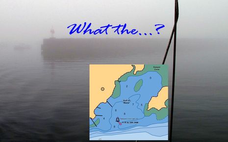
Yup, the first time you cruise into Sawyer Cove in often foggy Jonesport, Maine, you may be surprised to discover that there is a substantial steel and concrete breakwater extending from the fixed light almost all the way to the Eastern shore. That’s because the structure still hasn’t made it onto the official charts, or any chart I’ve seen, even though it was built over 20 years ago, and even though the NOAA ENC inset above was updated on 9/17/2010. I mentioned this when I first wrote about Sawyer Cove in August, but that entry was largely about how poorly any of the guides — digital or paper, professionally written or crowd sourced — covered the facilities available. Since then I’ve learned more about the breakwater situation, and it’s depressing…
Ever since I browbeat NOAA about the screwy private channel bouys that showed up on the new paper, RNC, and ENC harbor charts for Camden this spring — and which turned out to be the result of a PATON application poorly filled out by our harbor master, but are yet to be fixed on the charts — they have graciously fielded other cartography questions. When I asked about the Jonesport breakwater, this is what I learned:
…the last time the shoreline
around Jonesport was updated was project CM8401 with mapping
completed in 1987 using aerial photos taken in 1985. We have a current
project in work (ME0702) covering this area, for which we have been
attempting to acquire acceptable tide-coordinated imagery for a while
now. I think we have two flight lines left to be acquired. As soon as
all of the imagery is acquired and processed it will move into the
compilation phase. With the number of projects we have in the
pipeline, I expect it will be a couple of years yet before the updated
shoreline for Jonesport is delivered.
Wouldn’t you think that there’d be some quicker mechanism for dealing with major changes like this breakwater, especially as it no doubt involved permits, surveys, and probably even federal money? Heck, the characteristics for that fixed navigation light — a database maintained by the USCG and passed along to NOAA — states that it’s “On end of breakwater” (which you can find out from the Light List or by drilling down on the ENC vector chart). But I trust that there’s a reasonable explanation for the NOAA process, and that nothing we can say will change it anyway.
And therefore this large structure certainly serves as a solid example of why we need easy ways to create user generated information and integrate it into electronic navigation. And it’s just the sort of issue that excites me about Navionics big embrace of crowd sourcing. While I could post a Hazzard Note about the breakwater on ActiveCaptain, and finally did today, a Navionics UGC entry stands a good chance of being validated and becoming part of the chart database used by lots of boaters who’ve never heard of crowd sourcing, and may not want to. I don’t know if Navionics will qualify chart updates based on UGC (not hard to do in a vector chart) but it doesn’t take much Google research to find a vivid photo of the beastly breakwater or even a reference from a professional print guide.
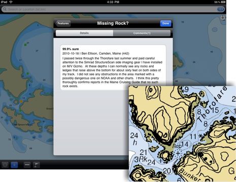
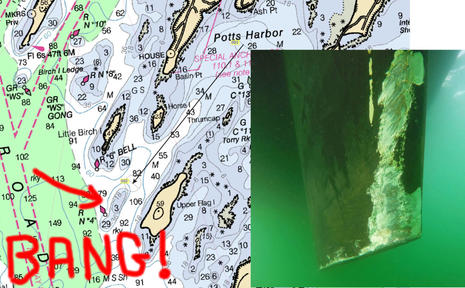
What’s likely much harder to do is to remove something that’s theoretically dangerous from a chart, and again the Jonesport area provides a good example. The shortest, most scenic route from Sawyer Cove to a major Maine wonder — the long and virtually unspoiled fine sand beach at Roque Island — is through the Thorofare. Except that according to the official chart there’s a “rock awash” right in the middle of its narrowest section. On the paper/raster version the rock is notated as “REP” for “reported” which gives it a lot less weight in my mind, but on the ENC chart, and at least one of the commercial charts which all tend to mimic ENC data, that “reported” status is omitted, even in the verbose object details. Maybe that’s why the ActiveCaptain entry warns against running the Thorofare without local knowledge, despite my edit suggestions. And why I saw yachts crawling through there even though the two best printed guides to the area debunk the rock pretty thoroughly via multiple first hand reports (i.e. secondhand crowd sourcing).
And I’d like to think that my first hand account, now in AC as shown below, is especially compelling, thanks to StructureScan. But what will Navionics do with information like this? Sure, it will stay in the UGC “community layer”, kind of like AC, but the next step, actually removing a possible danger from a chart, is a stupendous liability. I’d guess that NOAA would have to send a ship and wire drag team, some day. Maybe, given enough UGC, Navionics would add a notation stating that many users could not find the damn rock? Welcome to the new world of crowd sourced charts. I think they’ll be better charts but it will pay to have programs like CE and MS TZ that can manage multiple sources, as discussed on Friday. What do you think?




Ben:
I’ve been through that thorofare more than a dozen times over twenty years, at all states of tide, and have not been able to verify the existence of a rock where noted on the chart. Also a concern is the notation of depths in the adjoining Bunker Cove. At MLLW there is less than four feet, NOT six or more as shown.
I can’t wait. There are lots of little issues I would like to correct in Huntington Bay, including the positions of the nav aids and some floating docks that are in what appears to be the channel on the charts.
There is a photo of the Thorofare at what appears to be extreme low tide with no rock showing:
http://commondatastorage.googleapis.com/static.panoramio.com/photos/original/26752697.jpg
I don’t know what the protocol is for turning a “reported” rock into a charted danger, but could it be that this Thorofare “rock awash” symbol is based on a single mistaken report, but has been causing heartburn, or long detours, for decades?
And how will a bogus danger ever get removed from a chart? Here’s a news item that indicates how hard it is for NOAA to free up survey resources for a remote area like this one:
http://www.bangordailynews.com/detail/145551.html
Incidentally, that’s Navamatics Charts & Tides seen on the iPad screen above, and I’m sorry to report that it never shows the proper “plus” sign for the rock no matter how far you zoom in. Not good.
Ben,
This is one of the most valuable posts I ever read on Panbo. I’ll never lay out a route and have the autopilot follow it with great comfort again in Maine, especially in fog. Since Coastal Explorer can only use the government raster and vector charts, (and Chartworld) we have to be especially cautious as we are at the mercy of a seven or more year lag on possible chart corrections. Wish CE would add Navionics chart capability. This would give us a choice to use charts from a more progressive source. In the mean time, the crowd sourcing features will be a great help.
Richard, the old saying up here goes something like this: “There are just two kinds of cruisers: those who have hit ledges, and those who are going to.” I’m in the former category, several times over, though glad to report that no crew or vessel suffered major damage.
But the problem isn’t so much charts as fog, curiosity, and the amazing complexity of the coast around here. The dangers are well charted in my experience, often down to odd rocks in remote coves, and they rarely change. The main chart problem are the occasional changes like that breakwater (and the dredging within Sawyer Cove) plus anomalies like the imaginary rock blocking the Thorofare.
But these relatively-rare-in-Maine issues sure make me wonder about other parts of the coasts where the bottom is shifty and development is on a much faster pace.
Ben,
The United States Power Squadrons (USPS) have a cooperative charting program with NOAA. Through this program members send updates to NOAA for incorporation. If you contact a local squadron in the area (http://www.usps.org/cgi-bin/sfind.cgi)they may be able to get NOAA to corect the charts.
Raul
Richard, Chartworld charts are Navionics Charts Converted to S57/63 IHO vector format, but agreed this may introduce additional delay into the updating process.
I think we are reasonably lucky here, the Admiralty to their credit are reasonably quick to respond to changes, and so they should be with 75% of World shipping using either theirs or Admiralty derived products. The problem is the same this side of the pond, where ever shifting sandbanks and other coastal anomalies make chart updating a hopeless task, a bit like painting the Forth road Bridge or the Golden Gate..it never ends.
Thats why we can, in some areas, rely on localised web sites like this one:
http://www.eastcoastrivers.com/
These guys even have their own survey vessel and also pay for more detailed surveys when needed. Look at the sketchmaps on the website which are excellent.
Whilst basking in my own reflected Panbo glory on the boat at the weekend, I was looking at a brand new MFD with C-map charting, on a freinds boat and I noticed that Torquay Harbour had not been updated with the new Town Dock Marina…and that happened over 18 months ago. It’s on my Admiralty rasters, so why not the CM cartridge?
He was a bit glum when he realised that his brand new pride and joy was already 18 months or more out of date. I think yet another CE customer in the making.
Steve.
“– and which turned out to be the result of a PATON application poorly filled out by our harbor master, but are yet to be fixed on the charts –”
This is the most common source of such errors as we reviewed last time. Have the Harbormaster correct all the Private Aids to Navigation permits so that the aids match the lat/longs on the paperwork and vice versa. Also any buoys missing numbers should have numbers applied. The permits will go to the USCG and the corrections will flow thru the notice to mariners (if needed) and on to NOAA for chart corrections.
The June survey of the harbor shows the discrepancies and deviation from the permits. The question is whether NOAA should use the permitted locations or the surveyed locations for the chart. If the permitted positions and the actual positions of the aids are matched and “correct” and the USCG passes the info along, the chart corrections will follow.
Of course any third party chart seller can do whatever they want to their versions including adding boater data.
Doug
Doug, I keep asking our Harbormaster if he’s received any paperwork on bouy positions, and he says no. Nor does he know anything about a “June survey”, nor do I. I did receive from NOAA a new set of buoy coordinates that look correct, but I have no idea who collected them, when they did it, or anything else. This does not seem to be a cooperative, transparent process, to say the least. As best I can tell, correcting those buoys is at a standstill.
Also, no one has ever answered my question about how such an unusually buoyed channel got through USCG/NOAA quality control. Seriously, have you ever in your life seen a set of buoys like that where there are no obstructions? Heck, even when there are obstructions? In my opinion, the channel buoys never should have been put on a chart that way.
The USCG Auxiliary has a Private Aids to Navigation verification program. Members go thru a training program to become verifiers to inspect / survey and report discrepancies. In USCG Aux District 1NR which includes Maine, the information on Private Aids (PATONS) is online for the Members to maintain when they do their inspections and verifications along with bridge data.
Reports flow to the USCG and on to NOAA if charts are affected. Chart Updating reports are also part of Auxiliary Aids Verifiers activities especially for shoreline updates which can be an off-season activity.
Private aids are placed and maintained by “private” entities including the state. Basically an aid is a private aid if it is not a Federal Aid. You can imagine that that activity is subject to the same quality variances as any other activities of these agencies or entities. I see this first hand frequently while out on the water.
Budgets today are slim or non-existant for much of these floating balls and signs on posts in recreational waterways. As Ben has demonstrated, a super fancy chart system with all the ebells and ewhistles has input from a long people and paper chain with the data massaged by marketing. Just ask the sub Captain who ran into the sea mount what he things about fancy hardware and fancy charts.
Doug
I agree Ben. It looks like a string of minor errors that when plotted on a chart look strange and out of order. We all know that the Camden entrance is a straight shot but the numbers that went thru the system apparently did not carry that knowledge.
I had asked you a bit ago if I could get the original permit positions to plot with all the other info we could find to help resolve the discrepancies. I think there must be about 4 or 5 sets of lat/longs now. I will also check (I hope this Thursday) where any chart updates may be.
I think this example could be a good teaching tool to show how we have to be careful at each step of the process of permits, data analysis and entry, synchronization of differant entities information and chart updates.
Doug
Sounds like you chaps need to form yourselves into some sort of co-op like the eastcoast rivers guys I mentioned yesterday, http://www.eastcoastrivers.com to look after the harbor buoyage and stuff. If it’s all that far out of whack and the authorites aren’t interested it needs some more decisive action from somewhere else.
Steve
Thanks, Doug, but what does “data massaged by marketing” mean? Of course no amount of “ebells and ewhistles” (nice turn of phrase!) can make up for chart anomalies, but they sure as heck can provide useful secondary information.
Consider the main subject of this entry, the Jonesport breakwater. Just about every “super fancy chart system” I know of gives a navigator some way, or multiple ways, to learn about this huge uncharted object before it becomes a confusing in-their-face surprise…be it photo maps, Panoramio pics, ActiveCaptain notation, Navionics UGC, text in a POI, whatever.
Of course it would be much better if the breakwater was charted, and let’s be realistic about that. Isn’t the fact that something so significant — which even has a federal aid to navigation on top of it — has gone uncharted for twenty years plus, and will remain uncharted for a “couple” more, a sign that the update system may be broken?
Staying with the details of this entry, I’d also like to know why the current ENC does not seem to indicate the “reported” status of the non existent Thorofare rock while the current paper/RNC chart does? An actual change in status, an RNC-to-ENC translation policy, an omission, data not showing on my viewers, what? Evidence is mounting that ENC charts are less informative than the original raster charts, and that’s not good.
As always, I see no fault with any individuals working for NOAA, the USCG, or elsewhere. Everyone seems to be doing the best they can within frameworks developed over decades if not centuries. But I will keep pounding on these subjects as they’re important to all chart users out in the field. Including those with “super fancy” systems 😉
PS Doug, are you sure you want to argue that the sub captain who hit the uncharted sea mount blames his electronics? I’ll do some more research for a separate entry.
I have never seen where Navionics or CMAP-Jeppesen have changed any “on the water” or coastline data on one of their charts that was not already found on a government chart.
They will only change non-water information as far as I have found. I’ve heard through rumors that this is for legal reasons.
Does anyone have one single example of where this has been done?
Will this change with Navionics UGC?
Anon, I think you’re pretty much correct, except for special cases like the Bahamas where the manufacturers have licensed privately collected data. Navionics even ran some of its own surveys there.
At any rate, that’s why UGC is a big deal. It remains to be seen how much or what types of user submitted data Navionics is willing to add to its charts, but that’s the idea. Check out Guiseppe’s “Beyond HO’s” powerpoint presentation in this photo:
https://panbo.com/assets_c/2010/10/Navionics_mobile_lab_cPanbo-2910.html
It also remains to be seen if C-Map, Garmin, or Navico will follow suit to some degree or perhaps integrate an existing UGC system like AC…
Good grief, it gets worse. If you click and view the big version of the Thorofare illustration above, you can make out two dark lines paralleling the shores southwest of the imaginary rock. On the raster chart, they are pretty inconsequential, and I really don’t know what the cartographer was trying to say with them.
But on the ENC version each of those dark lines is identified as a pier, a pier running from about the low tide line along the low tide line. Near islands with no roads or buildings. Who is translating raster charts to ENCs? Who is checking them?
If you look at Google Earth, you’ll see the breakwater clearly shown.
I’m a little amazed that NOAA can’t acknowledge the ommission and make an adjustment. They might (although embarassing) make a notation with a couple of lines and a note that says “REP Old Big Ass Breakwater Structure 2010”. ;^)
Ben:
Your comments about poor chart quality rang a bell with me. My wife and I have the same issues in Mexico. The charts in Mexico are often off by 1 to 3 miles.
I have a partial solution for this problem. I have developed a computer proram that converts Google Maps into standard NOAA compatiable Raster Charts. The charts can then be used with your favorate navigation program.
We have been using this program on our sailboat S/V True Love to augment our Mexico charts and find it very helpful.
Hey Bill, Sorry I didn’t respond to your e-mail, but I did try your ‘chart’, and just wrote about it:
https://panbo.com/archives/2010/10/jonesport_breakwater_aid_with_chartaid.html
Just wanted to point out that the rock symbol in the Thorofare shown in the paper/raster chart does NOT indicate a rock awash, but actually indicates a “dangerous underwater rock of uncertain depth.” See Chart No. 1, symbol K13.
The dotted line around the rock symbol (cross) is a “danger line, in general” which is another way of saying the location of the danger isn’t really pinpointed. See symbol K1.
The rock awash symbol is shown in K12, and is a “squarish” symbol consiting of a cross with a dot in each of the 4 quadrants. See symbol K12.
While most of us know to stay away from all the rock symbols, it is still useful to review all the various rock symbols, which indicate whether the rock is not covered at MHW, covers and uncovers, is awash at MLLW, or is underwater at MLLW.
Chart no. 1 sections can be downloaded at:
http://www.nauticalcharts.noaa.gov/mcd/chartno1.htm
I think you’re missing some nuance, Brian. When a rock’s depth is “uncertain”, one possibility is near zero, which is nearly awash. Certainly the cartographers seem to think of it that way. If you click on the ENC vector version of that Thorofare ‘plus’ symbol, the object label is “Underwater rock / awash rock” just like it is for the ‘asterisk’ a little ways to the northeast.
If you drill down into the object properties, you get the exact lat/long of the plus sign and this description:
Underwater rock / awash rock
Quality of sounding measurement: depth unknown.
Water level effect: always under water/submerged
The object description for the asterisk symbol is exactly the same except that its water level effect is “covers and uncovers.”
Note that there’s a significant difference between awash and uncovers in a place like this with 12′ of tide. Rocks marked with the asterisk may be just below the surface at mean high, which means they could be 11.9 feet higher than a rock that’s awash at mean low. The difference between awash and submerged at unknown depth could be inches.
I always thought of the various “awash rock” symbols as a gradient the cartographers use to express the severity of possibly hidden danger, with the plus symbol at the low end. Still no prudent sailor takes six feet of draft over a plus symbol at half tide without extreme care.
I looked around for the plus sign with four dots and am sorry to report that the one I found on the RNC has been turned into an asterisk on the ENC. In other words its indistinguishable from a rock that uncovers unless you dig down into its properties where it’s given a depth of “0.0 ft” and a water level effect of “awash”. If that RNC-to-ENC translation is consistently true, it’s another way that ENCs are less immediately informative than raster charts.
Ben:
We can certainly agree that in a passing through a narrow channel with a 12′ tide range there is much nuance to consider when assessing symbol for “sunken rocks” (K2 and K13), “rocks which cover and uncover” (K11), and “rocks awash at the level of chart datum” (K12). I also concur with you that ENC symbols without the label “rep” are “less immediately informative.” There’s a limit to decluttering.
As discussed in the NOAA Chart User’s Manual on p. 4-24:
” “Rep” (Reported). The “Rep” label shall be attached to a charted rock because it is considered dangerous to navigation, but which has not been confirmed by an authoritative field observation party. … As a practical matter, mariners would do well to resolve the cartographers’ uncertainty by assuming that the feature exists. Where adequate safe water exists adjacent to the feature, mariners should simply avoid the potentially hazardous area.”
Not always so simple!
In the case of transiting the Thorofare, the key expections should be: 1. “unknown depth at MLLW” and 2. “not authoratative”. Envisioning awash at low tide might be comforting, but the prudent navigator does not ….
For ENC users, checking the underlying properties of any hazard object (or referring to raster/paper) is doubly important to properly calibrate what the cartographers really know.
BTW — best as I can figure, this stealth rock was reported between 1960 and 1965 based on a perusal of NOAA’s historical charts and Coast Pilots.
http://www.nauticalcharts.noaa.gov/staff/charts.htm#hcoast
Thanks, Brian; interesting findings!
I have looked around the ENCs enough to know that it is possible to carry the “Rep” information over. You’ll see a question mark alongside the charted rock, and its object data spells out “reported”, though not necessarily when.
The Thorofare rock has none of this on the ENC, even though the paper/RNC chart with “Rep” has almost the same update date. I wonder if the “Rep” was simply lost, maybe by the same team that somehow turned two odd raster lines into very improbable “piers”.
It would be a shame to lose the “Rep” qualification without a good reason, especially as this non-existent rock has been causing angst for fifty freakin years now! I just wish I’d been smart enough to take StructureScan screen shots all around that area. I’m 99% sure there’s nothing but flat mud bottom along there, but who knows what it will take to “resolve the cartographers’ uncertainty”:
https://panbo.com/archives/2010/10/simrad_structurescan_learning_the_tool.html
“best as I can figure, this stealth rock was reported between 1960 and 1965”
That’s way before GPS, so the question is less “does the rock exist or not” and more “where is this rock really”. It could be elsewhere in the same area or in some other area. If it exists.