Victron Venus OS v3.50 – New User Interface, Security and Generator Improvements
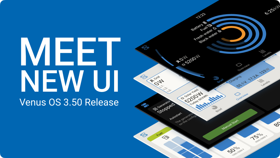
We are excited to announce the release of Venus OS v3.50. A massive milestone and improvement for our range of GX control and monitoring solutions. Whether you’re managing a system at home, in a marine environment, or on an industrial site, this release has something for you.
The new user interface
The most significant change in the new release is the new graphical user interface. The new UI brings a modern look, improved functionality, and a faster, more responsive experience. The best introduction is through watching this video:
To discover the full details and benefits of the new UI, explore our detailed slides covering this release.
Marine-specific updates
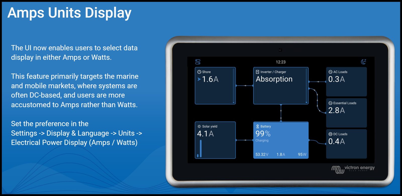
- The Marine MFD HTML5 App now supports Amp units for real time monitoring on multifunction displays and chart plotters. To see current in Amps instead of power, set the preference in the new UI.
- The integration with the ARGO Zeus Alternator controller now features DVCC integration, where the GX controls and optimizes the total system – including limiting charge current to be within the max allowed charge current by the batteries.
- The MG Energy Systems AFC 300 is now supported as an alternator controller
- The Fischer Panda AGT series of DC gensets can now be integrated over CAN-bus, providing (remote) read-out of all parameters.
- Wind turbine energy production, as well as the alternator outputs, can now be displayed on-screen, using a SmartShunt as a DC energy meter.
- Support has been added for the soon-to-be-launched Safiery STAR-tank sensors, which connect wirelessly to the GX via Bluetooth. These long-range Bluetooth radar tank level sensors, which are part of the Safiery STARSHIP product range, to be released at the METSTRADE Amsterdam next month.
- For yachts with multiple tanks, the new UI features some nice functions where it will display the total available fresh water, summarised across all tanks, and same for fuel or any other fluid type.
Improved security
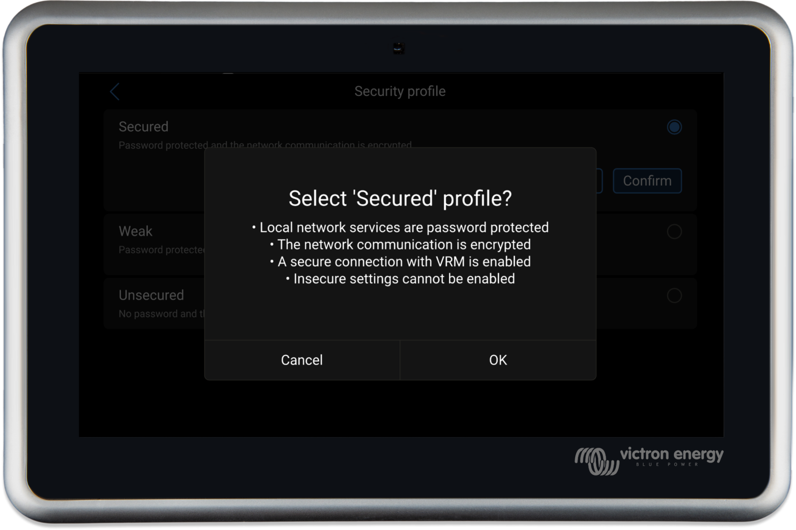
The new release brings improved local network security to Venus OS, by adding HTTPS security to the Remote Console on LAN. Additionally, the related settings have been simplified into a single new setting: the “Network Security Profile”. Password protection for MQTT provides additional security for third-party integrations, such as Home Assistant and Node-RED.
The VRM Portal-related settings have been simplified into a single option, allowing the system to be either completely disconnected from the VRM Portal, connected in read-only mode (which does not permit remote access for settings changes or firmware updates), or to have full control. This change removes the former “VRM Two way communication on/off” setting.
See the Security section of the slides for this release for more details.
Enhanced Genset integration & start/stop
Support has been added for five new genset controllers, including the popular Deep Sea DSE4520 MKII, as well as support for DSE over RTU.
The connection over RTU is a significant enhancement, as it reduces costs (no DSE Ethernet gateway required), and simplifies installation by eliminating the need for Ethernet hardware or networking knowledge. Please note the requirement for an isolated USB to RS485 interface; see genset features slides linked below for more information.
DC generators are now also supported in the form of Hatz and Fischer Panda.
Improvements have been made to the accuracy of reporting on generator runtime for both controller connected gensets and relay-controlled generators.
To see the full details on these updates, please refer to the genset features slides.
Node-RED
This release makes it possible to factory reset Node-RED on a GX device from the Venus OS Large submenu. This removes all flows and settings, allowing for a fresh start without the need for physical access to the device to factory reset its Node-RED settings, or completely.
Additionally, various new nodes have been added and existing nodes are improved, especially for Dynamic ESS, Peak Shaving, VRM and genset. For details, see its change log, starting from v1.5.18 up to and including v1.5.23.
Managed battery improvements
Various improvements have been made, including:
- Venus OS 3.50 now better handles Pylontech batteries experiencing cell voltage imbalance. For this improvement to be active, the GX needs to have access to the cell voltages from the Pylontech BMS. To check if a system has this capability, navigate to the Battery, then Details, and check for Lowest cell and Highest cell voltage readings. If not, it might indicate that the BMS doesn’t support it or needs a firmware update.
- Leoch-, new on the compatibility list, and Pytes battery integration now features auto configuration, DVCC force enabled, SVS and STS off.
- ZYC batteries integration also features auto configuration now, and moreover can now receive firmware updates directly through the GX device and the VRM Portal, marking a significant step in expanding remote management capabilities for supported batteries.
- Lithium Batteries South Africa, LBSA, has been added to our battery compatibility list earlier this week. Please note that there is no auto-configuration in the GX for LBSA yet: ensure that DVCC and other settings are enabled as recommended in the LBSA / Victron manual.
How to install and the complete change log
Aside from the highlighted improvements above, there are additional enhancements and changes. To read the details, please refer to the full change log by logging into Victron Professional and selecting ‘Firmware’ -> ‘Venus OS’ -> ‘firmware changelog’.
Information about how to install the firmware is in the manual of your GX Device. Quick links to the relevant pages can be found here: Ekrano GX, Cerbo GX, Color Control GX and for the Venus GX.
Conclusion
A big thank you to all the developers, designers as well as all users and professionals that helped to test this massive project. Re-implementing and improving such a large part of Venus OS is no piece of cake – and the result shows!
{Source: Victron Energy Blog entry 10/30/2024 by Matthijs Vader}
Panbo publishes select press releases as a service to readers and the marine electronics industry. The release contents do not reflect the opinion of the editors and are not fact checked by the editors




This new interface is awful. Especially for the visually impaired or just us old guys with bad eye sight. Lots of wasted space on the screens. On the screens that show tank and temps, how about just some numbers instead of a graph? Its a lot easier to see “87F” in 1/2″ tall font than tiny slashes that are not only light colored but also so tiny they look like eyelashes.
Hi Alex. My old eyes aren’t great either, but I’m pretty happy with the new interface, maybe because I have the little Touch 50 screen installed near eye level and in a place that doesn’t get much sun glare:
https://panbo.com/wp-content/uploads/2024/11/Victron-Venus-GUI-v2-on-Gizmo-11-2024-scaled.jpg
I am also happy to see that Venus OS v3.50 allows users to switch back to the old interface if desired (as had been the case during the Beta testing). I don’t know if that choice will stay for long, but maybe in the meantime Victron will add optional graphic screens with bigger fonts.
Victron has several new products at METS besides the Venus v3.50, like an NG (Next Generation) LiFePO4 battery and BMS system, and a smart watch interface to Victron Remote Monitoring:
https://www.victronenergy.com/blog/2024/11/15/metstrade-amsterdam-2024/