
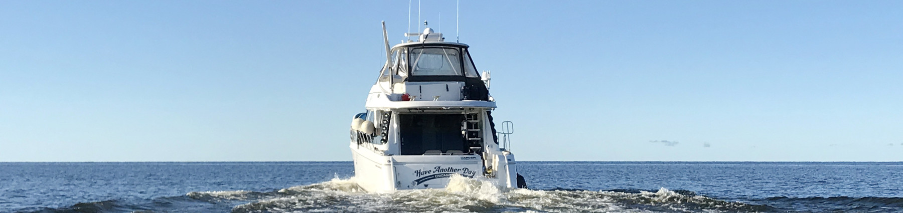
Argo Nav puts Army Corps surveys on the chart (and finally gets its Panbo review)
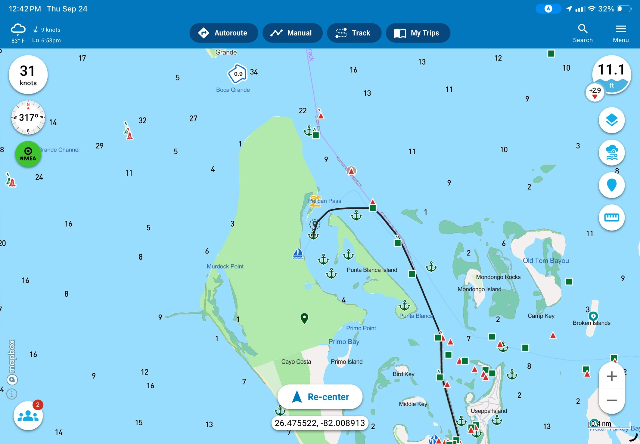
Despite a few mentions of Argo Nav’s capabilities, I have yet to write a full, hands-on review of Argo Nav’s mobile device navigation app. For the first several years Argo was around, founder Jeff Foulk didn’t feel the product was “ready” for a review. Now, as Argo has matured and Jeff is more confident in what it has to offer, my pokiness in getting a review out means I still haven’t completed a full Panbo review. Allow me to rectify that while also highlighting a new feature that is near and dear to my heart. In large part because of my time cruising the Intracoastal Waterway and its many shoaling hazards, I’m most excited about Argo’s addition of U.S. Army Corps of Engineers survey data overlays right on the chart.
Argo basics
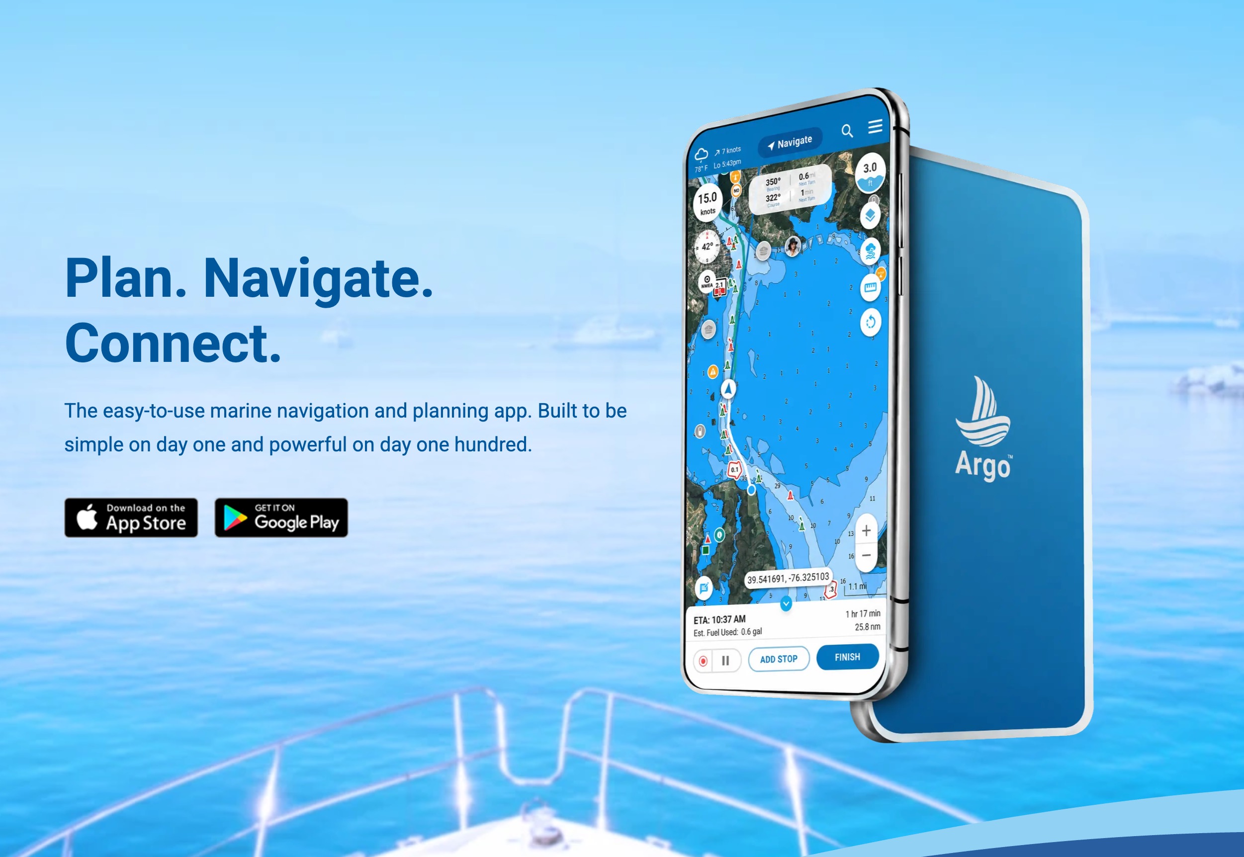
Argo is the brainchild of Jeff Foulk who set out to create a cleaner, more intuitive navigation app than those already available. Foulk’s background is in defense contracting specializing in survivability through systems engineering. So, he knows a thing or two about building robust and reliable systems that work in the harshest possible environments. Prior to the release of the Army Corps survey data, I spoke with Foulk about what makes Argo different than other navigation apps out there. He highlighted a few points around UI and ease of use but homed in on Argo’s planning and autorouting capabilities. We will take a further look at those capabilities in a minute, but first I want to focus on Argo’s newly implemented ability to overlay survey data from the U.S. Army Corps of Engineers (USACE).
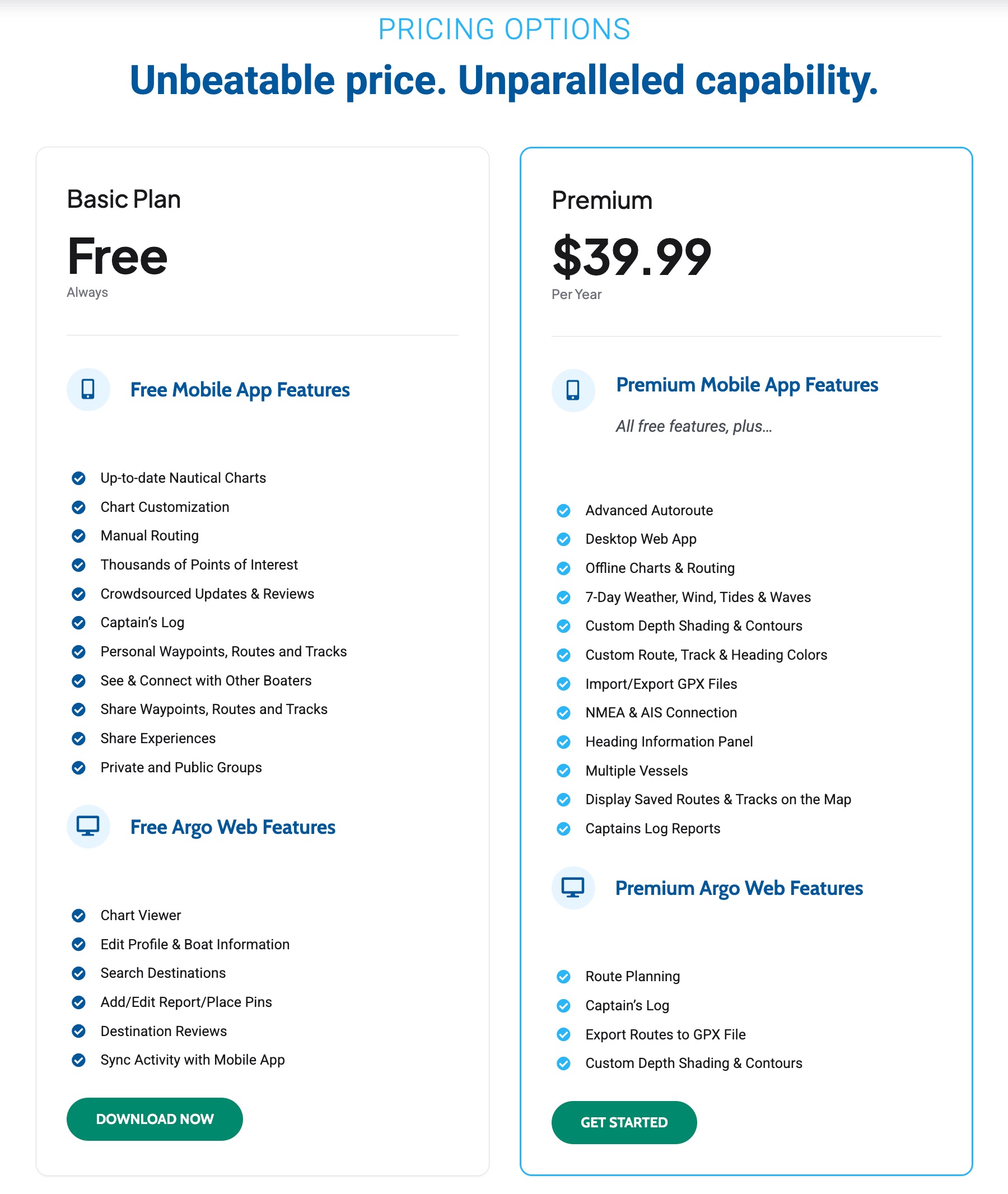
Argo’s free tier offers many of the core features of the app but without access to autorouting, offline charts, WiFi instrumentation integration, or the full web route planning capabilities. $40 a year unlocks all of Argo’s features. That makes Argo $10 cheaper than Navionics’ $50 per year subscription and with a richer feature set.
Army Corps survey data
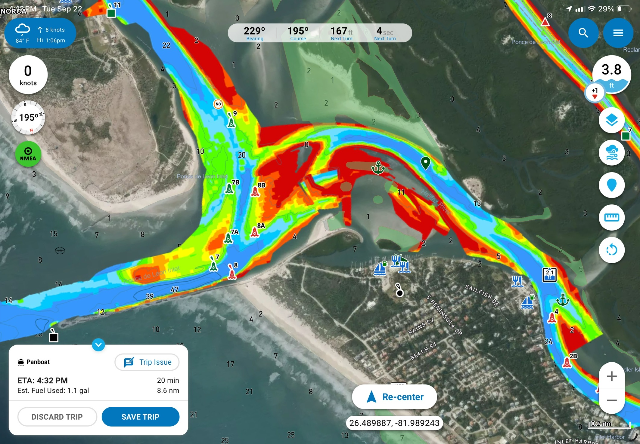
The Army Corps of Engineers regularly surveys federally maintained channels and inlets, paying particular attention to known trouble spots, and posts the results online. Eventually those surveys make their way into NOAA’s chart updates, but that process takes a while. In the meantime, the raw survey data is the most current depth information you can get.
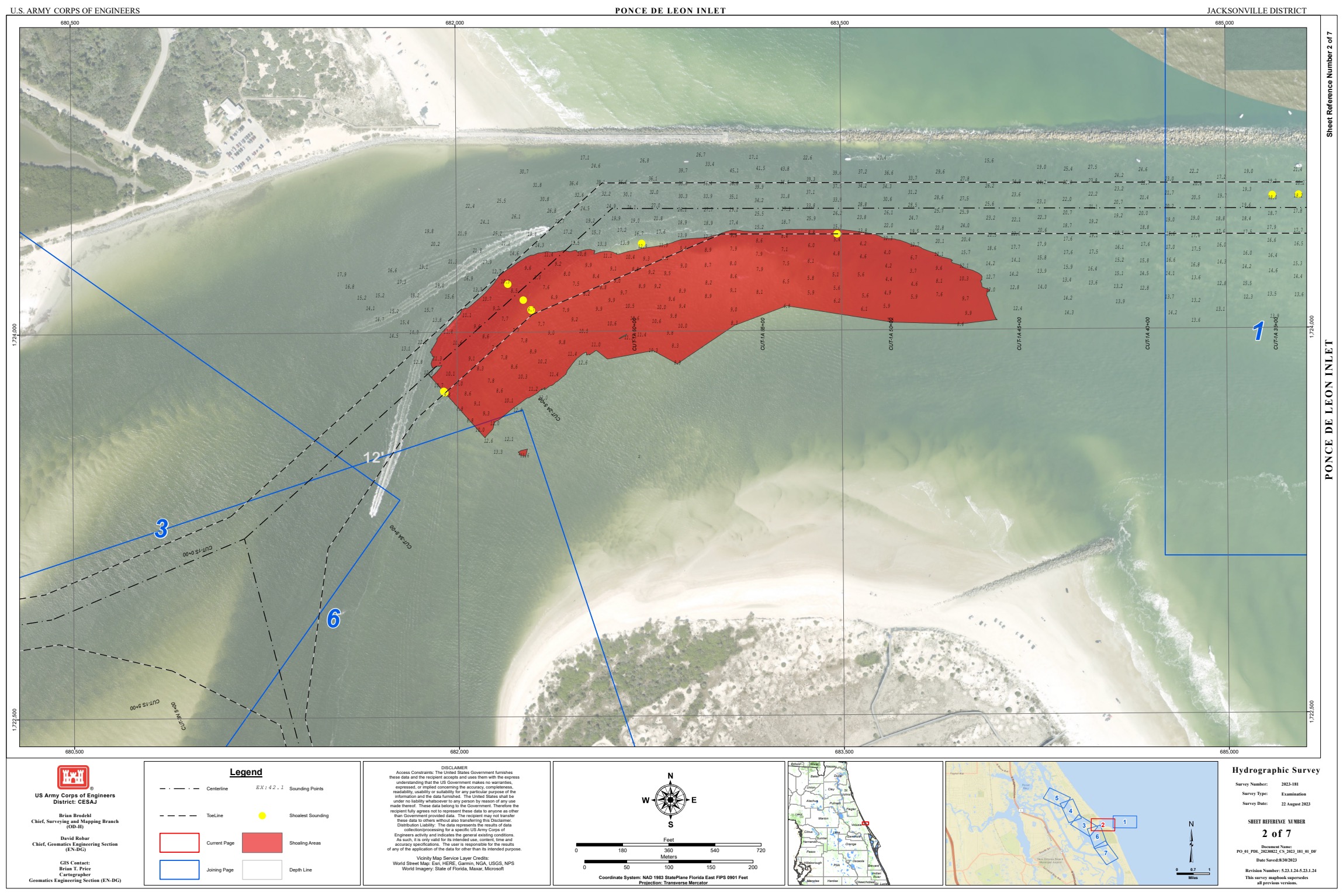
Way back during my first cruise of America’s Great Loop I discovered Robert Sherer posting as Bob423 on the then independently owned Active Captain. I learned that any hazard information posted by Bob423 would be detailed and highly accurate. In those posts, Bob mentioned downloading PDFs of USACE surveys. That was the first I heard of these magical surveys. I did download them, but the first time I tried to use one I realized how difficult it is to match up a PDF of an aerial photo with survey data overlaid. Suffice it to say, I was more of a hazard with the PDF in hand than I would have been just looking out the window.
A collaboration between Robert Sherer and Aqua Map resulted in a number of ICW-cruising-focused features as part of the Aqua Map Master feature set. Most notably, that feature set included overlaying USACE survey data in the app right over the charts. Those updates came back in 2019 and since then, Aqua Map has been the only navigation app displaying the valuable survey data. Aqua Map deserves credit for pioneering this, and I’m glad to see it spread.
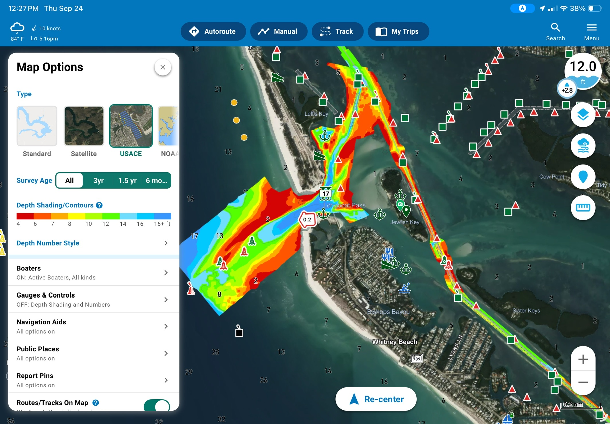
USACE surveys show up as an additional map type. Selecting it displays a satellite image with the surveys and all chart features overlaid. The survey depth coloring can’t be changed, though the style and frequency of depth soundings can.
Understanding survey ages
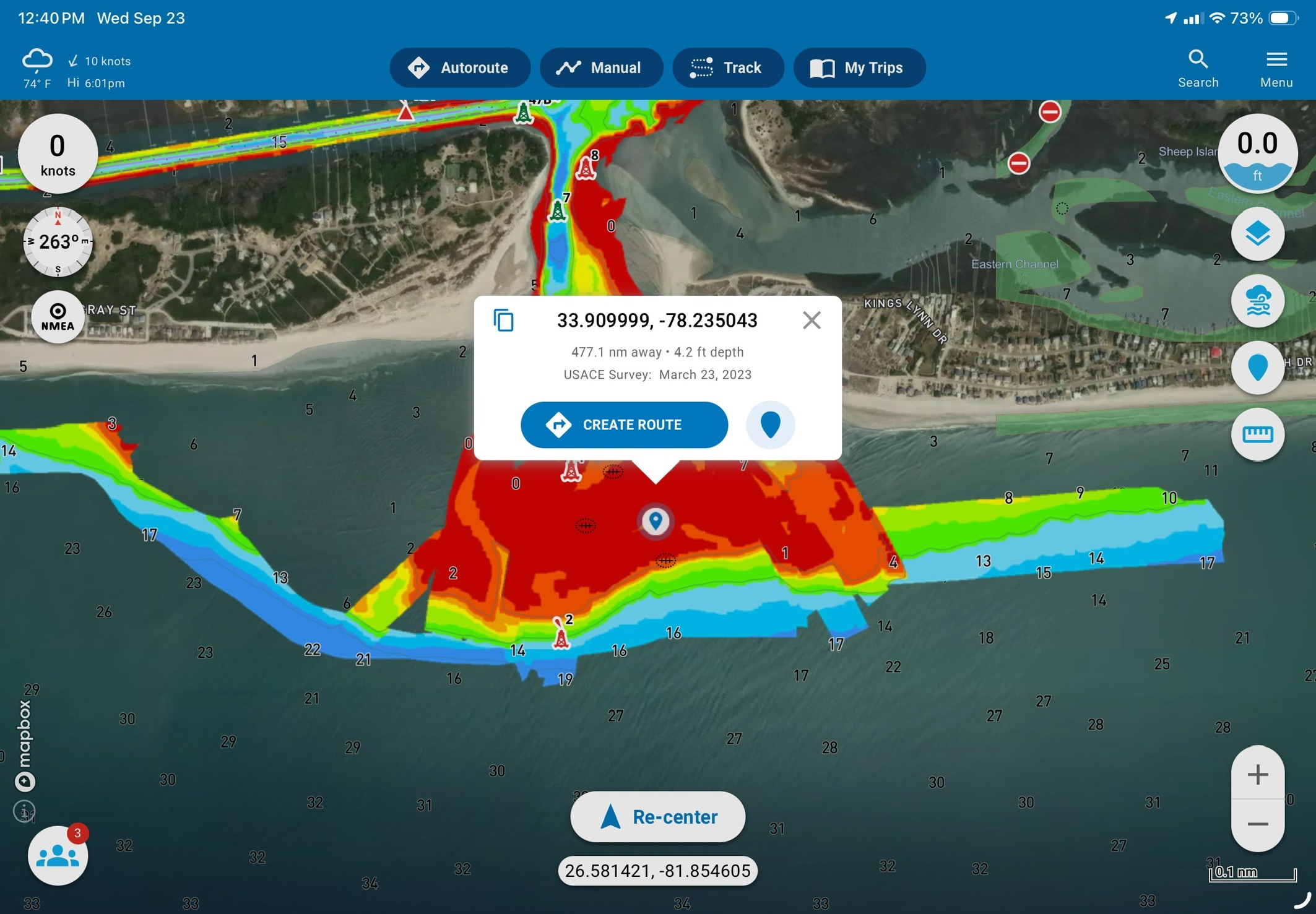
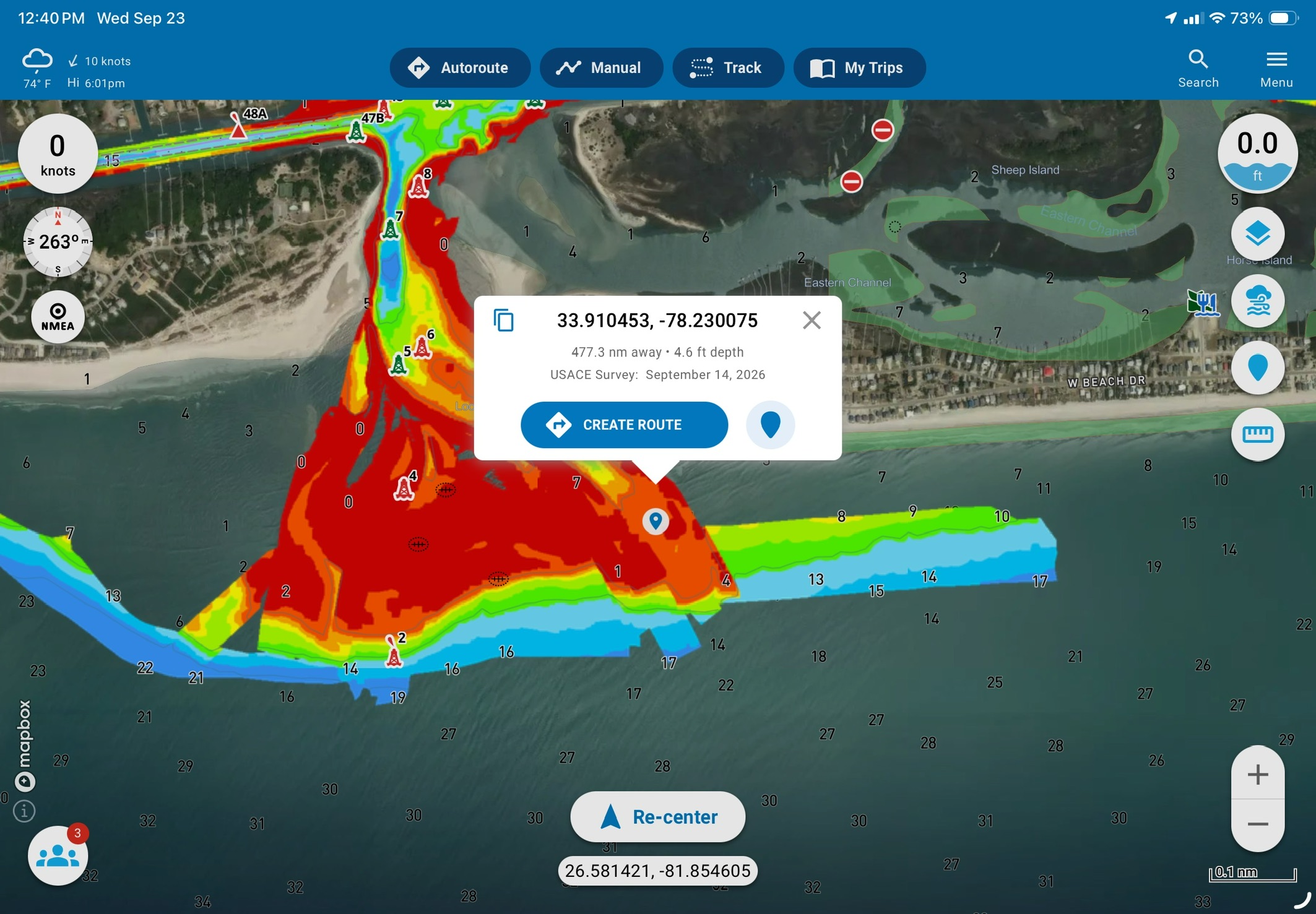
Aqua Map uses color intensity to indicate the recency of survey. At a glance, you can tell if a survey occurred just a few weeks ago or is older. Argo doesn’t have the same feature although the app does have easy filtering of surveys ranging from the last six months to all dates.
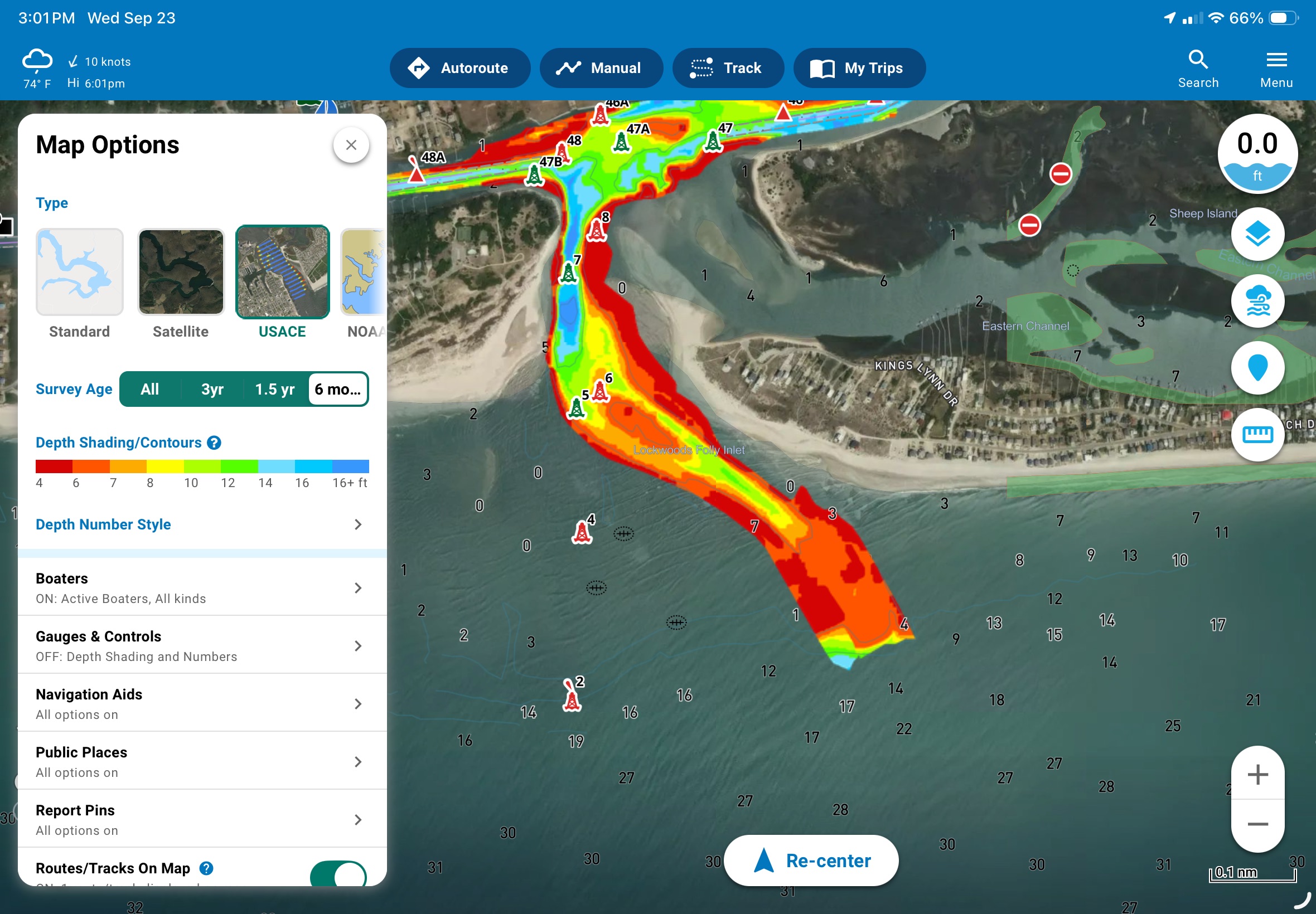
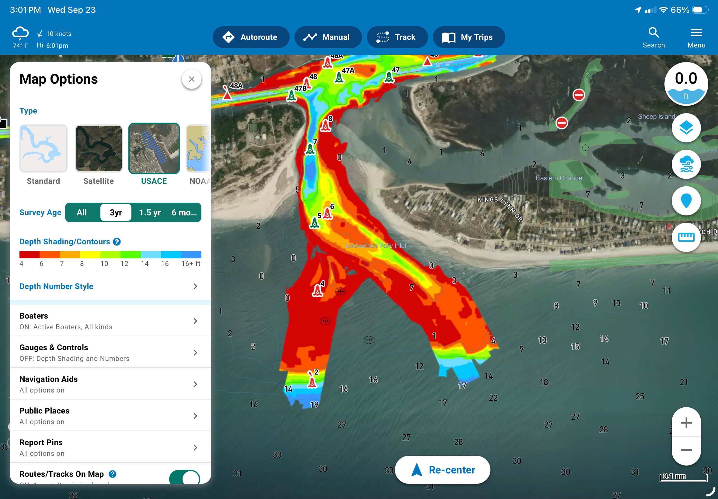
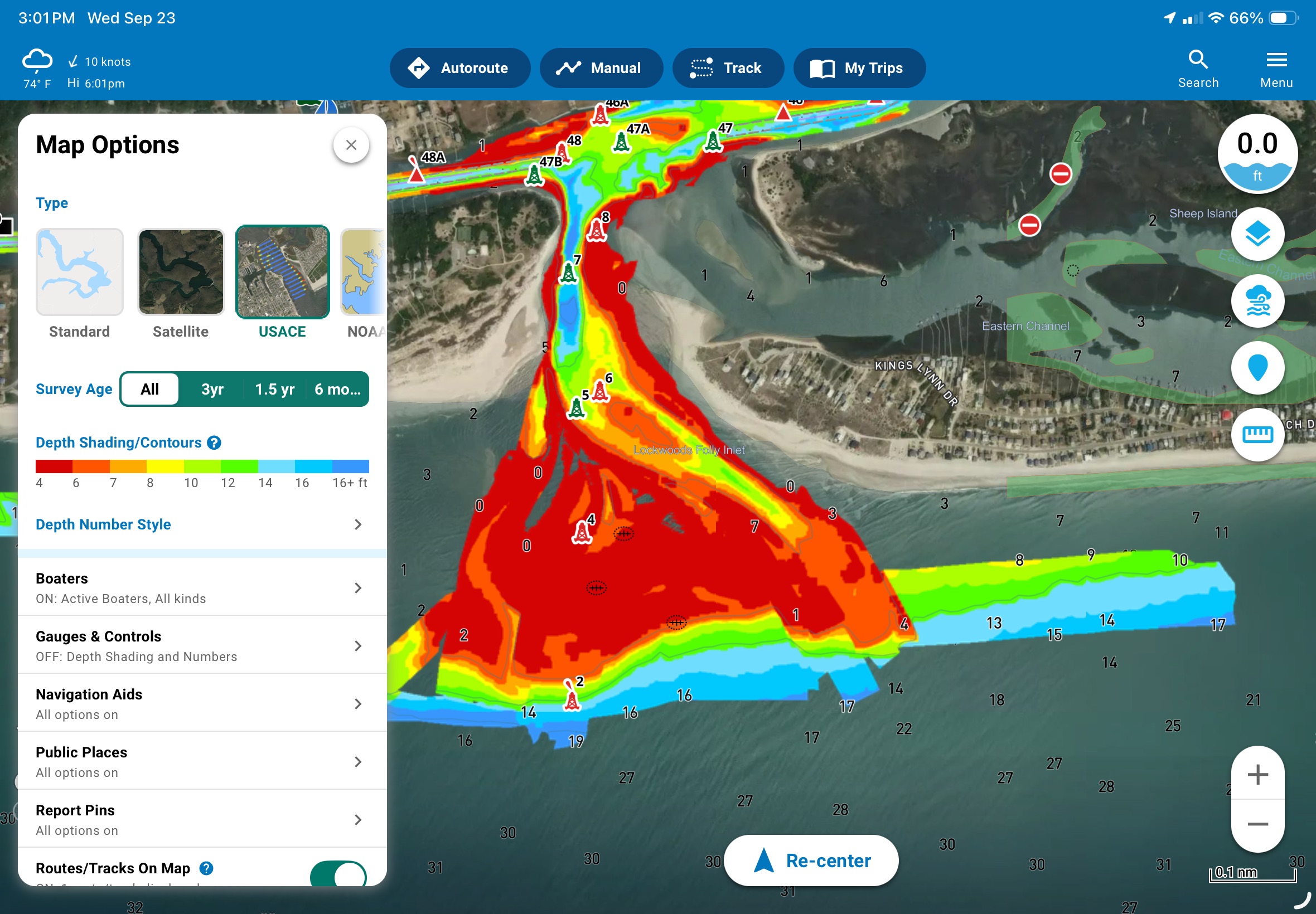
The gallery above illustrates the potential for differing ages of survey data. At first glance, it appears all survey data is likely the same, but in reality, the data displayed is from at least three survey passes over more than three years.
Fast autorouting with useful preferences
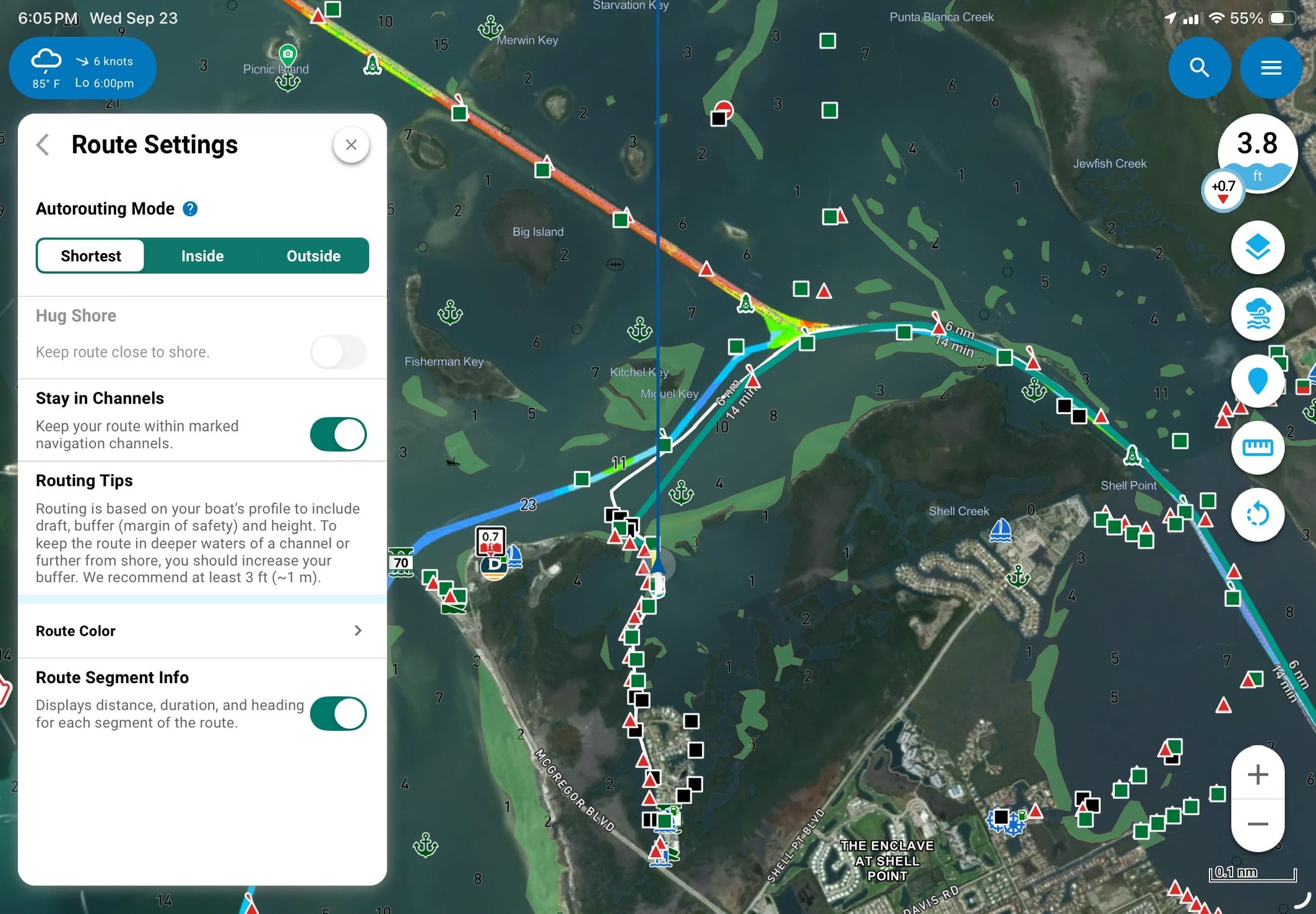
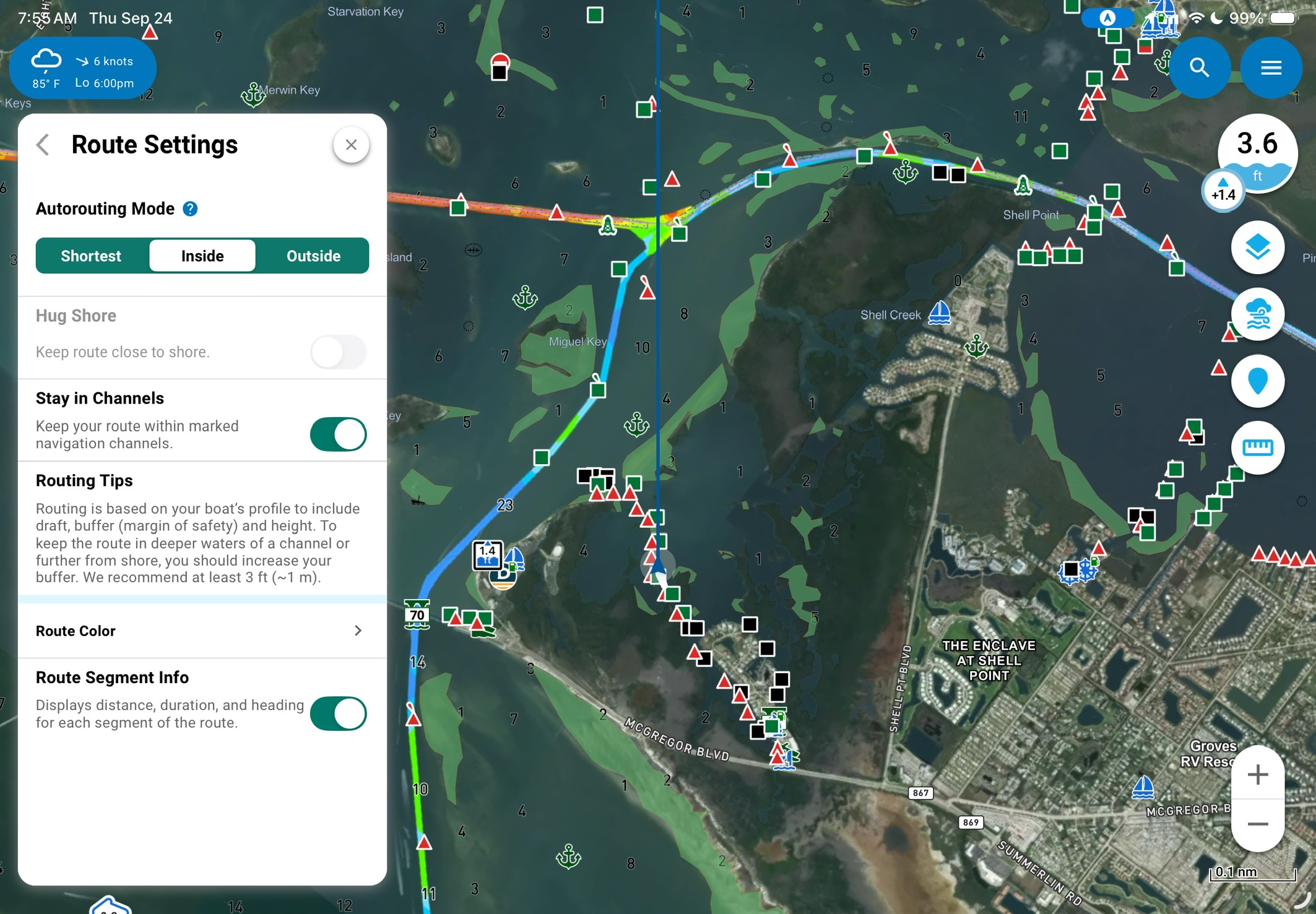
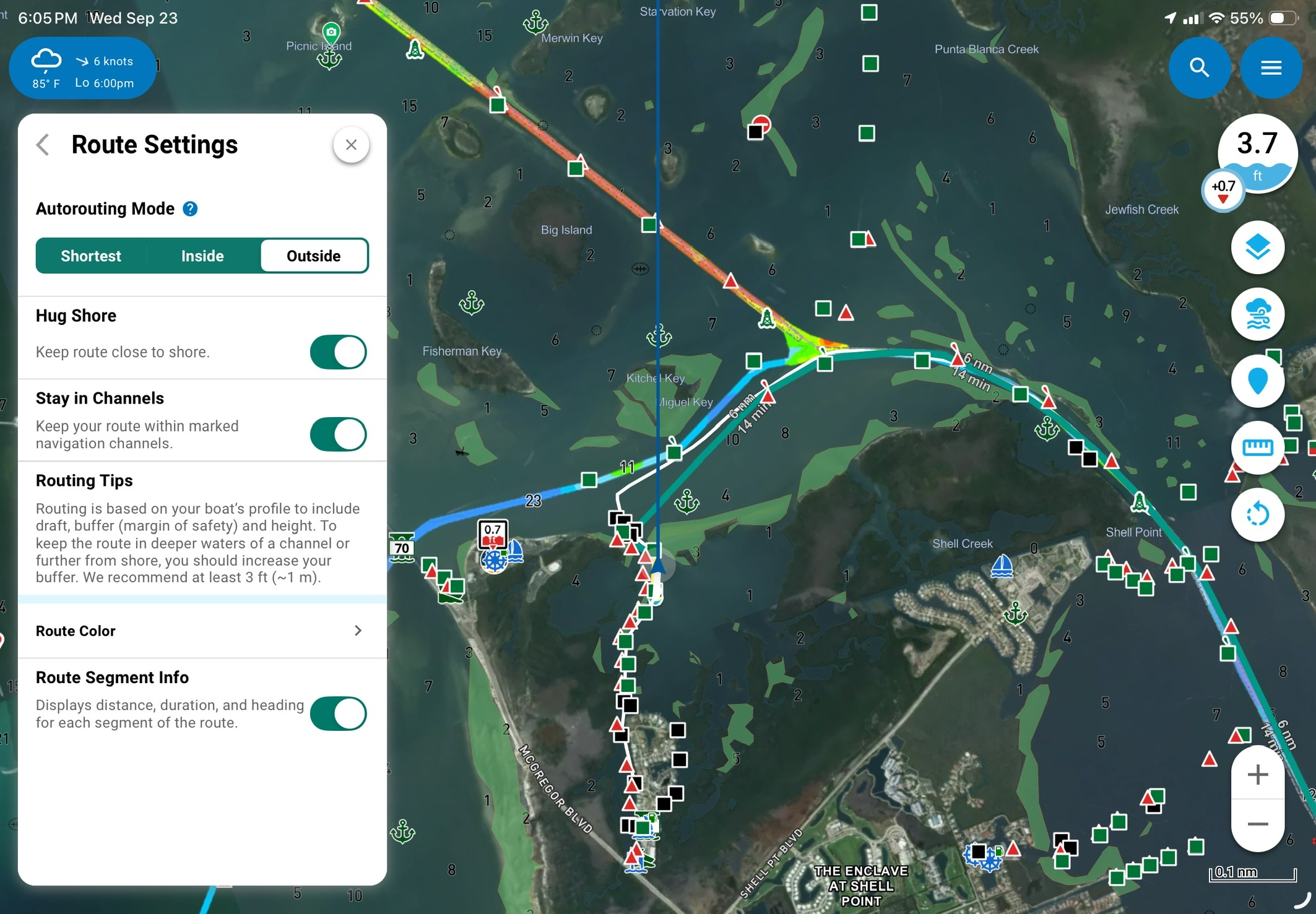
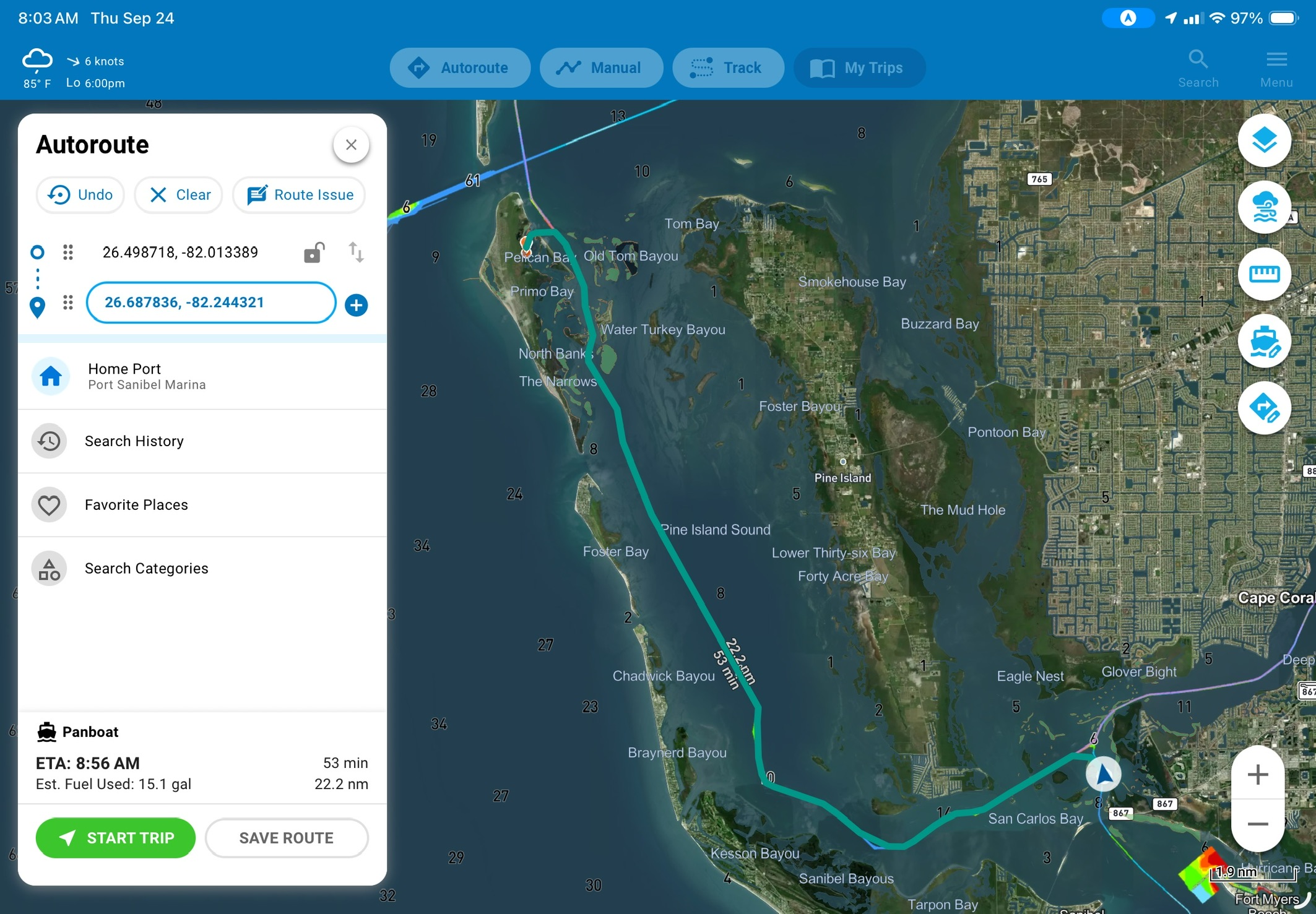
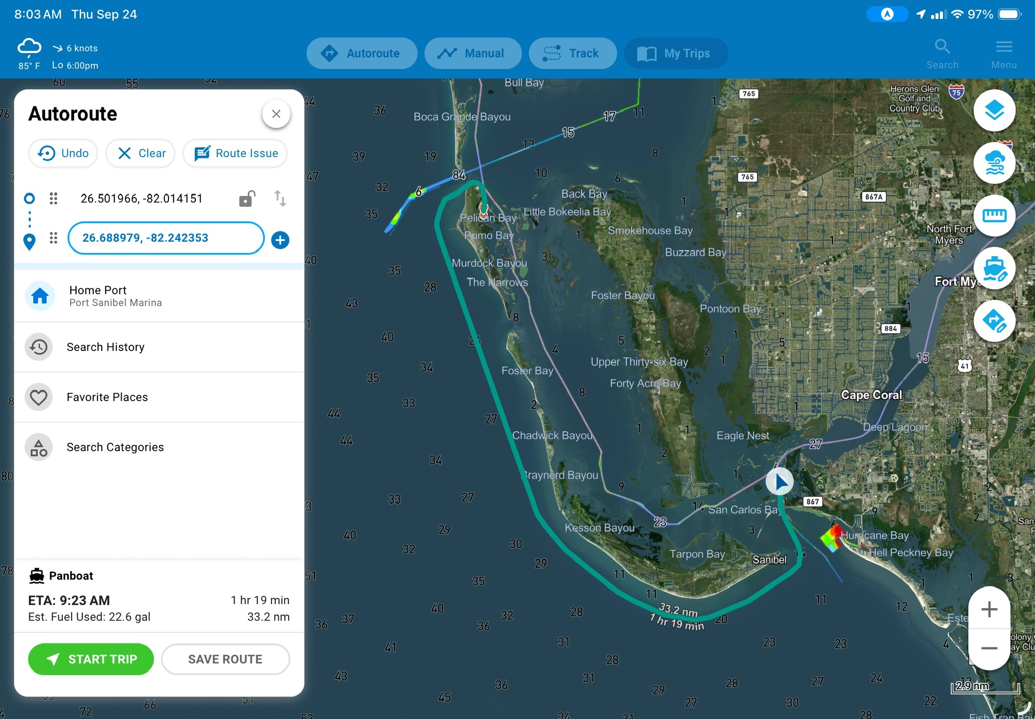
In my usage I have found Argo’s automatic routing to be surprisingly quick. That quick routing is augmented by the ability to select the basic route type you’re after. In my waters, there is frequently a question of running inside or outside. In testing various autorouting packages I have noticed that some prefer to run inside, while others will always choose outside. For example, Garmin’s autorouting with Navionics+ data nearly always selects outside, even when that route will add significant distance to a trip.
Argo offers three autorouting modes: shortest, inside, and outside. All three routing options allow you to select whether the route should stay in marked channels. Outside also allows the user to enable or disable hugging the shoreline. Allowing those routing preferences dramatically speeds route planning and allows me to make the call based on factors the app can’t know about. For example, if I have a crew with shaky sea legs, it’s often best to run inside regardless of weather outside.
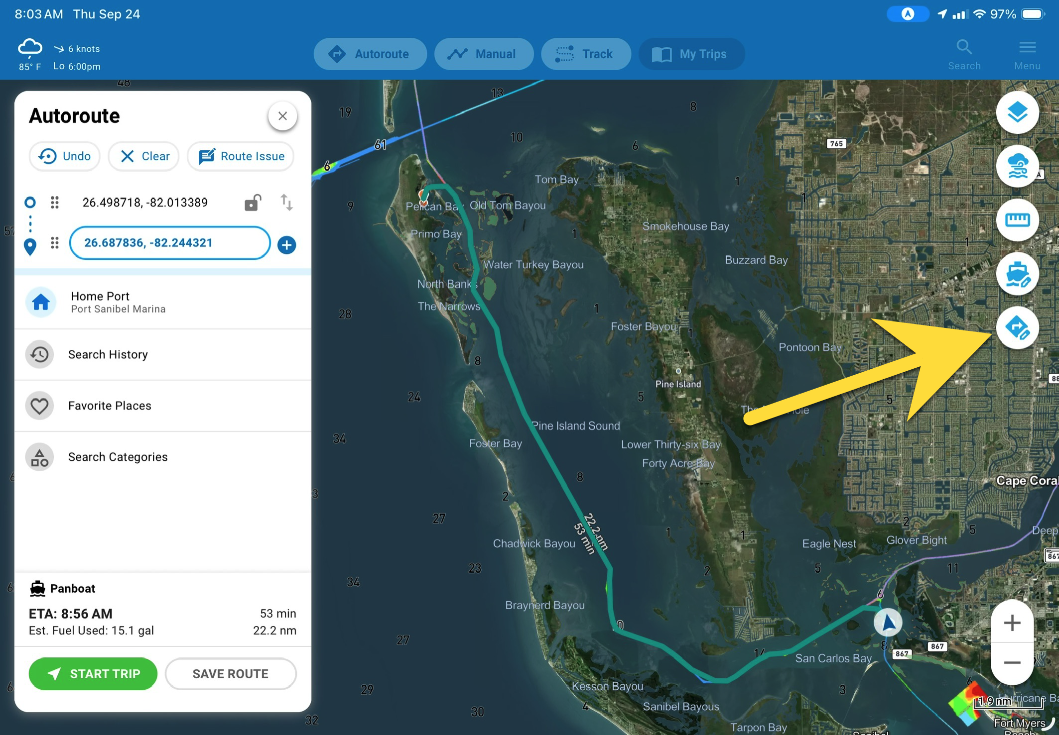
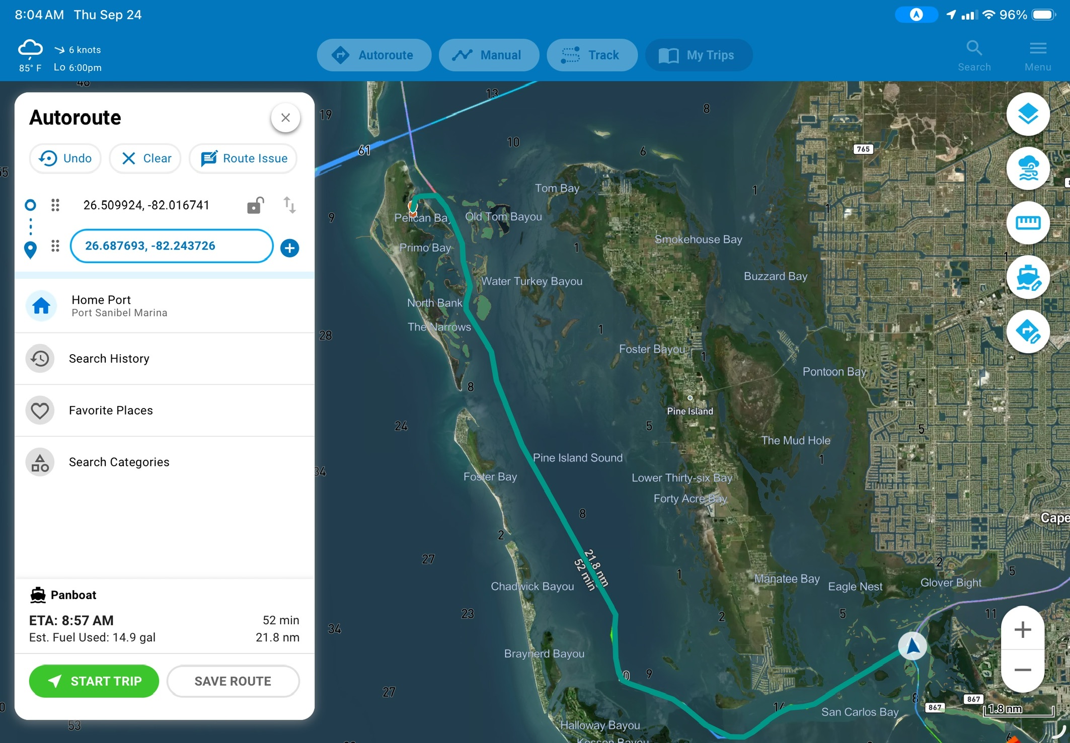
As useful as I’ve found routing preferences, I hope Argo might add quick access to them in the route planning dialog. It turns out Argo already has the shortcut I hoped for, I just missed it. While in the autorouting dialog, a new option appears on the right, as indicated by the big yellow arrow. That’s a shortcut to the route preferences screen.
Editing autoroutes
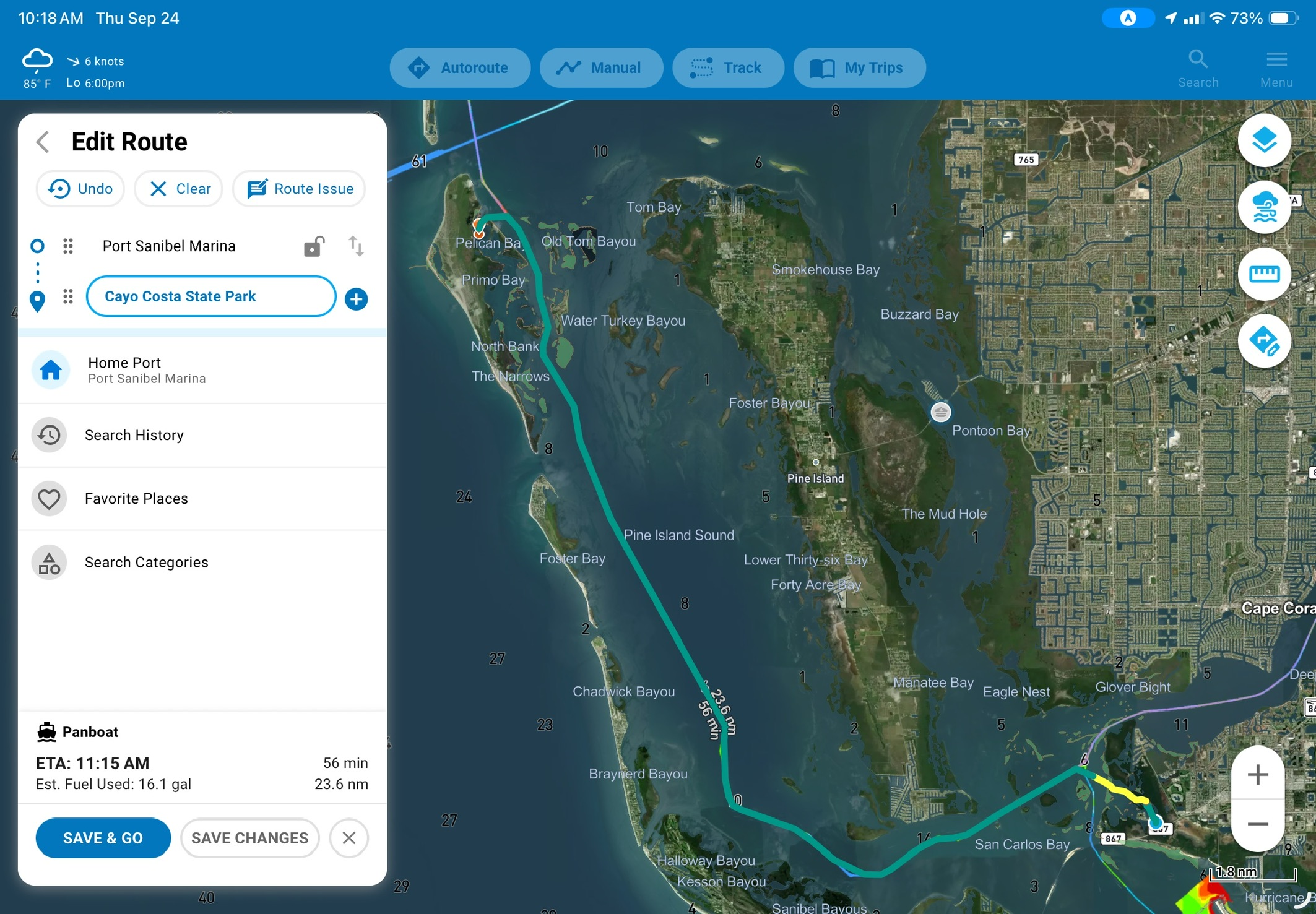
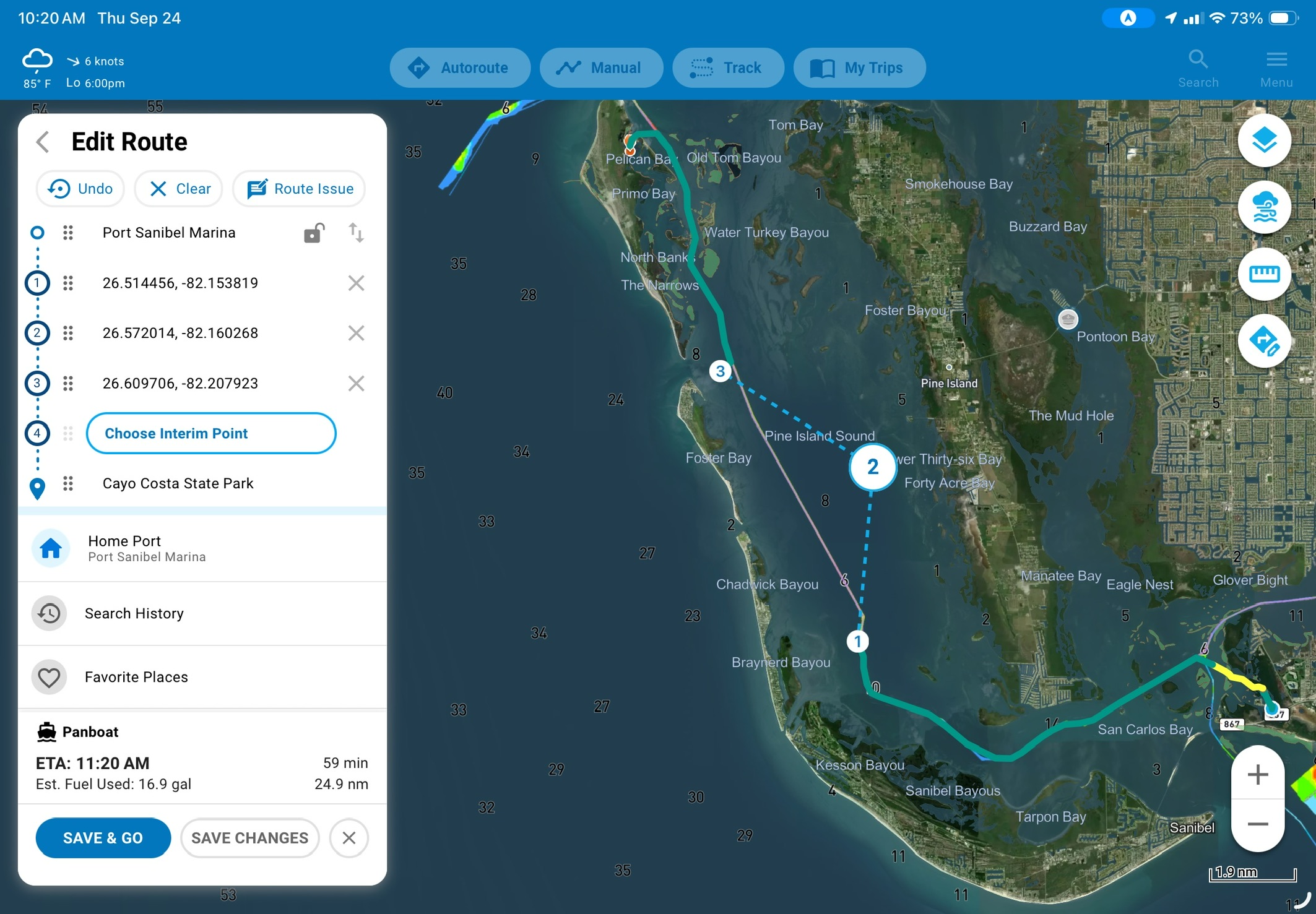
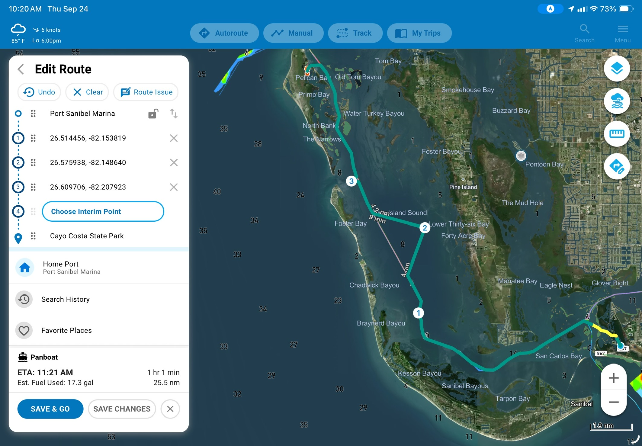
It took me a minute to figure out route editing for automatically plotted routes. Most navigation suites I use let you click and hold a route to enable editing and then allow some sort of dragging. Instead, Argo relies on adding waypoints into the route and then moving those waypoints. Although it’s an extra step, it works pretty well and does avoid accidental edits to the route.
Follow with care
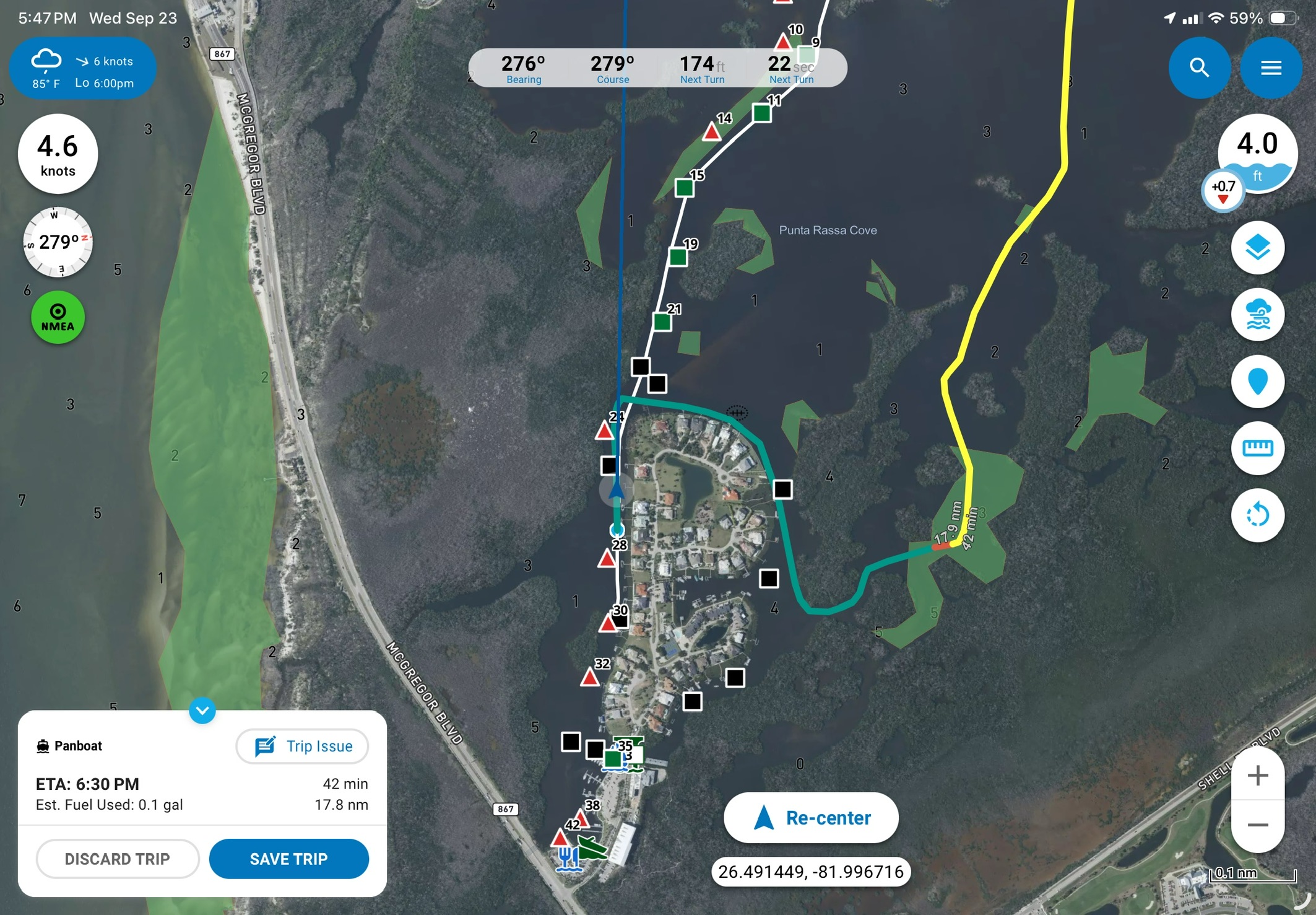
Every time I write about autorouting I feel obligated to address my hesitations with it. Autorouting isn’t perfect, to say the least. It follows what it thinks is appropriately deep water while trying to balance other factors. But, it also often misses things that are pretty obvious to us. Autorouting is as good as the data available to it, most importantly the bathymetric data it uses to find safe depth. Every automatic routing engine I’ve tried takes a route other than the marked channel. That channel is pretty skinny, but it’s marked and does carry about three feet at low tide. That’s more than can be said for most of the other approaches, including the one shown above. So, when autorouting plots a route for you, please give it a careful review. If you find yourself in skinny water, you will be paying the repair bill, not the autorouting engine. This isn’t an Argo specific issue and so far, Argo actually does better than most autorouting engines I’ve seen.
Web planning
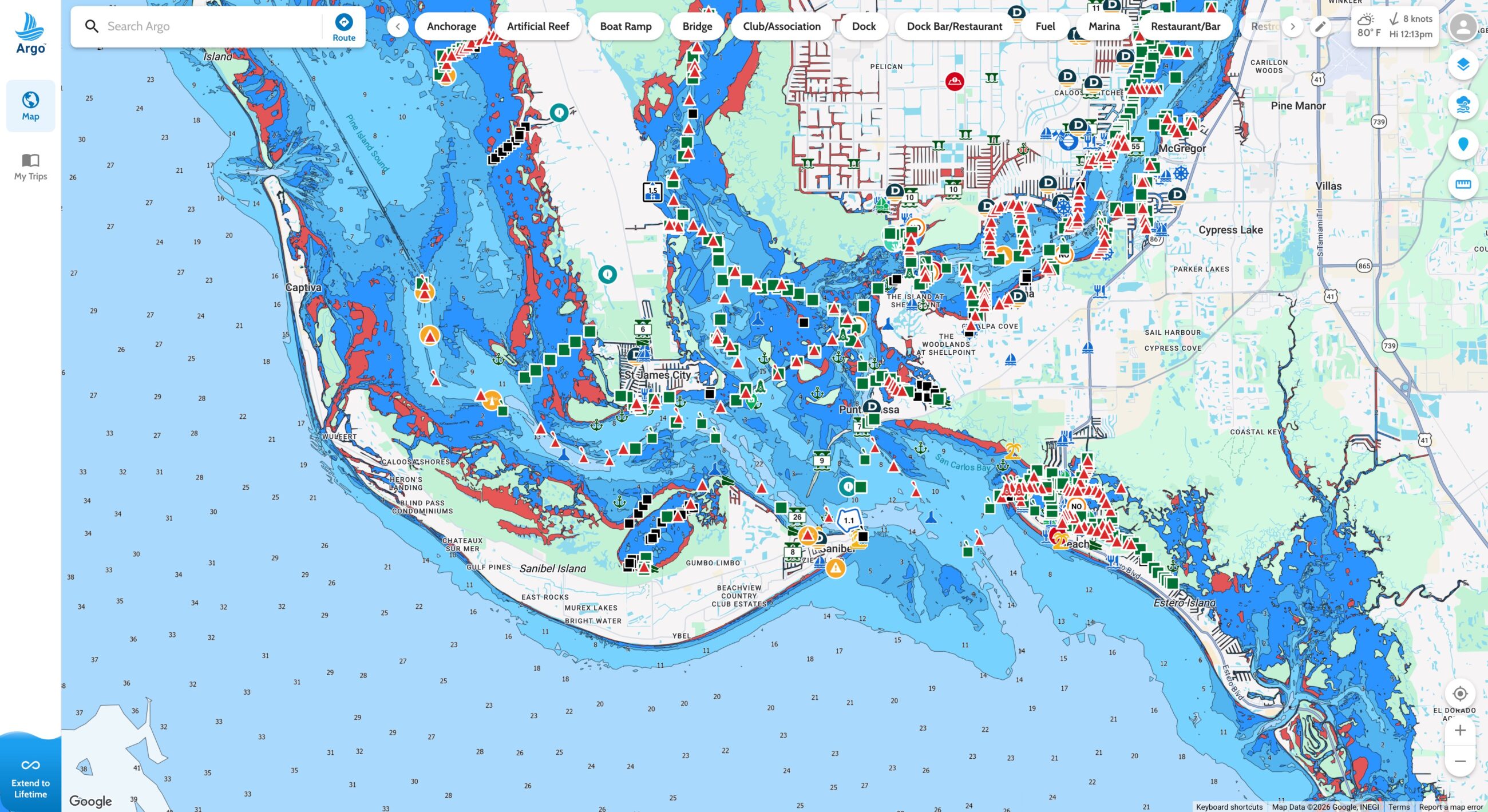
Compared to installed equipment on your boat, tablet navigation apps already enjoy the advantage of being able to plan from anywhere, couch definitely included. A strong web planning app makes your planning even more flexible. Argo’s web app allows full planning, autorouting, exploring points of interest, and access to tracks and trips. The web application recreates the same user experience delivered in the app so there is very little learning curve.
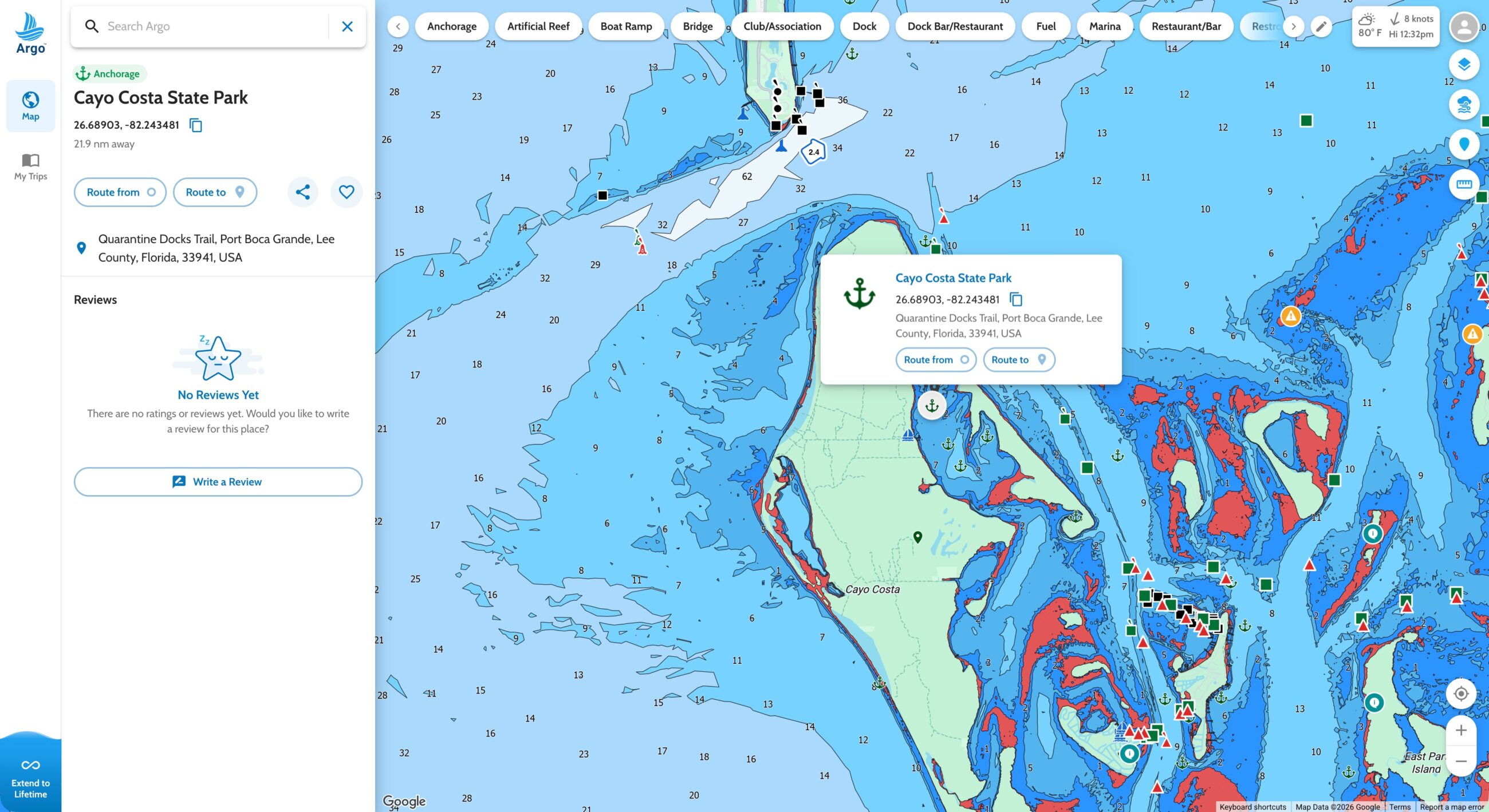
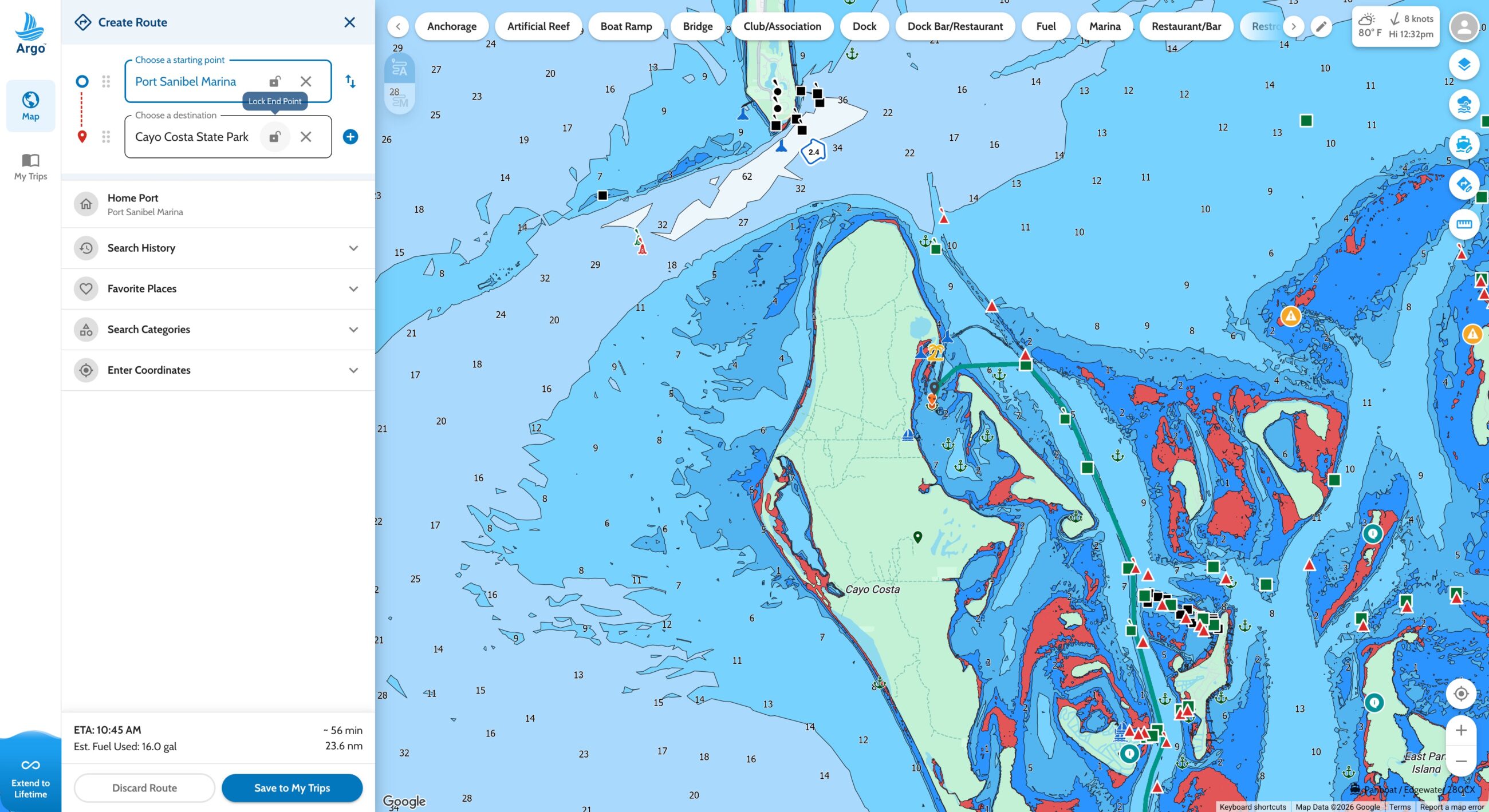
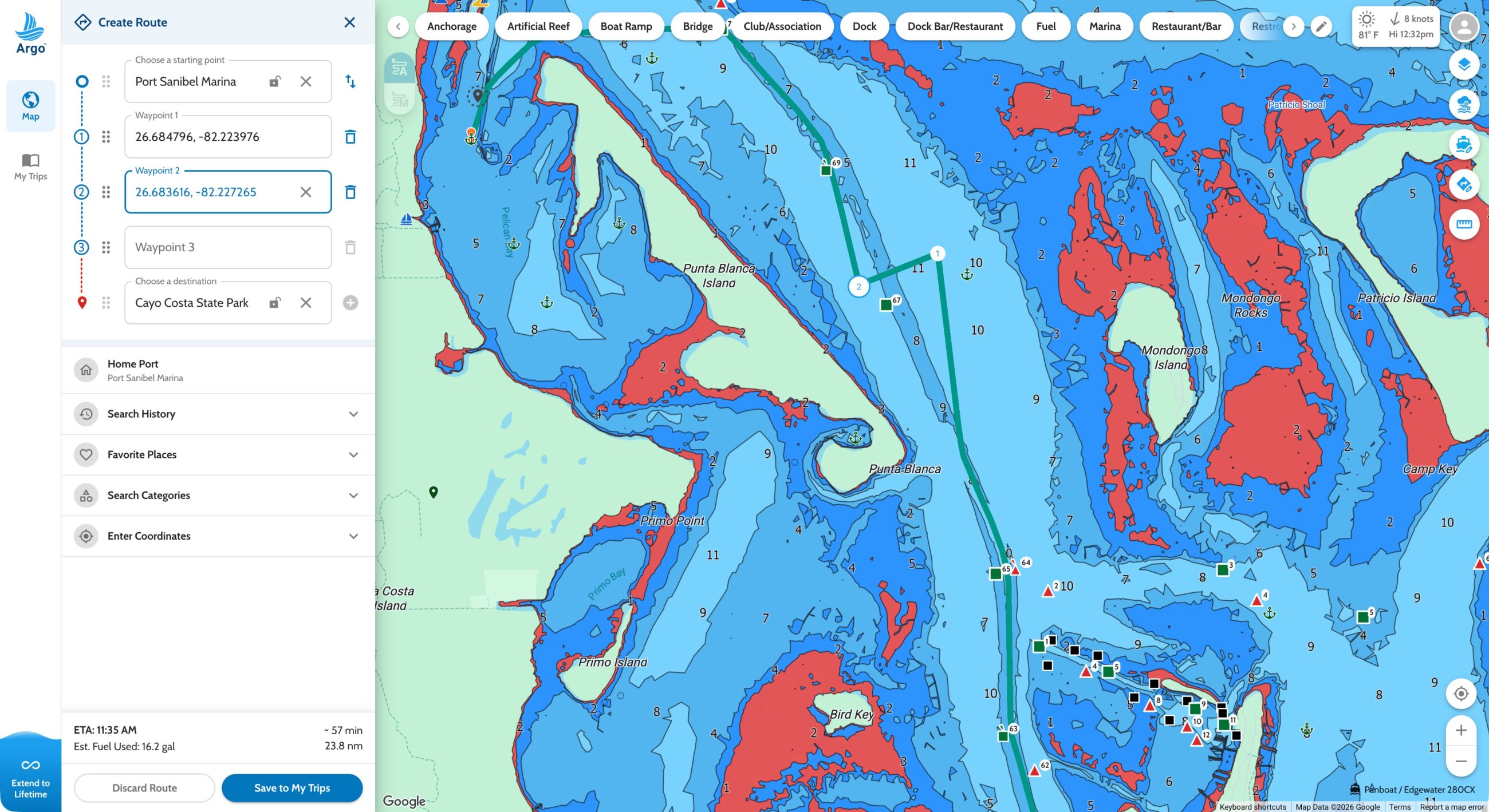
Although planning a route on the web is nearly the same as planning on the tablet, I often prefer planning on the web. My desktop computer has 27-inch, 4K monitors, so the extra screen real estate makes route planning easier. Just like on the app, editing an automatic route starts with adding additional waypoints and then dragging those waypoints to the exact location you want them.
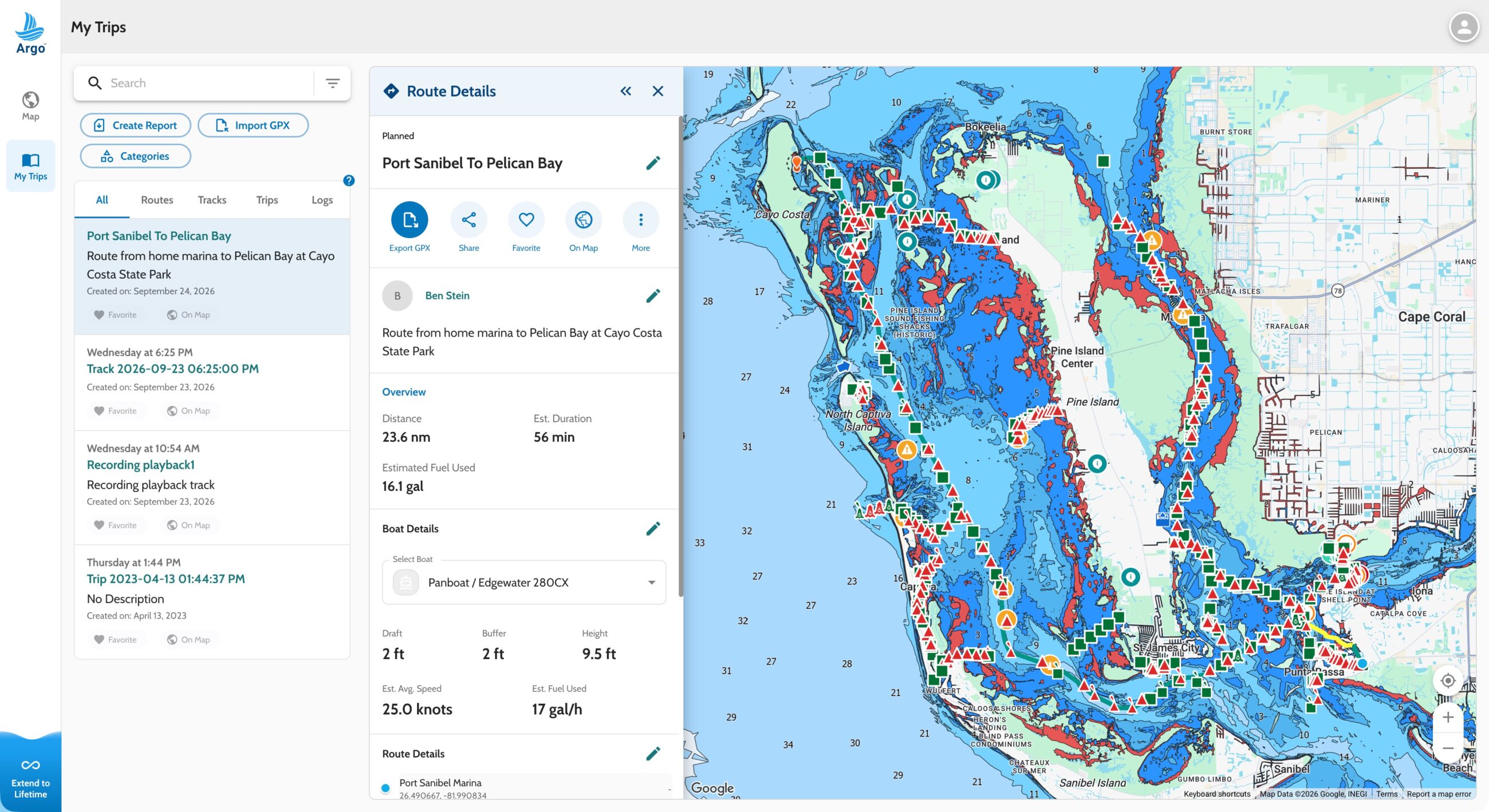
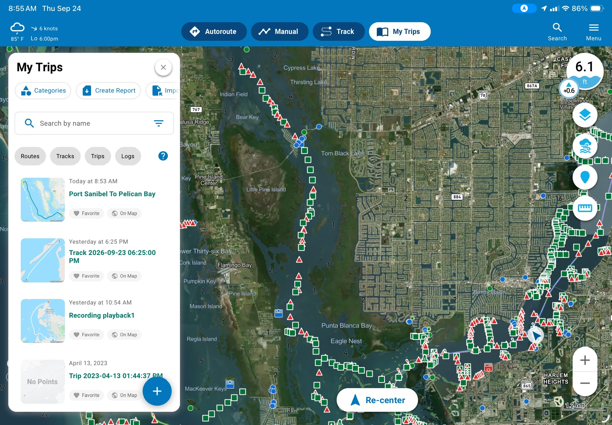
The best part of the web interface is how seamlessly trips sync. Regardless of whether a trip was planned in the app or on the web, it appears in both. The only caveat is that the app needs an internet connection to sync the trips. For me, that easy syncing is the difference between using pre-planned routes and just planning again when I’m on the boat.
Weather
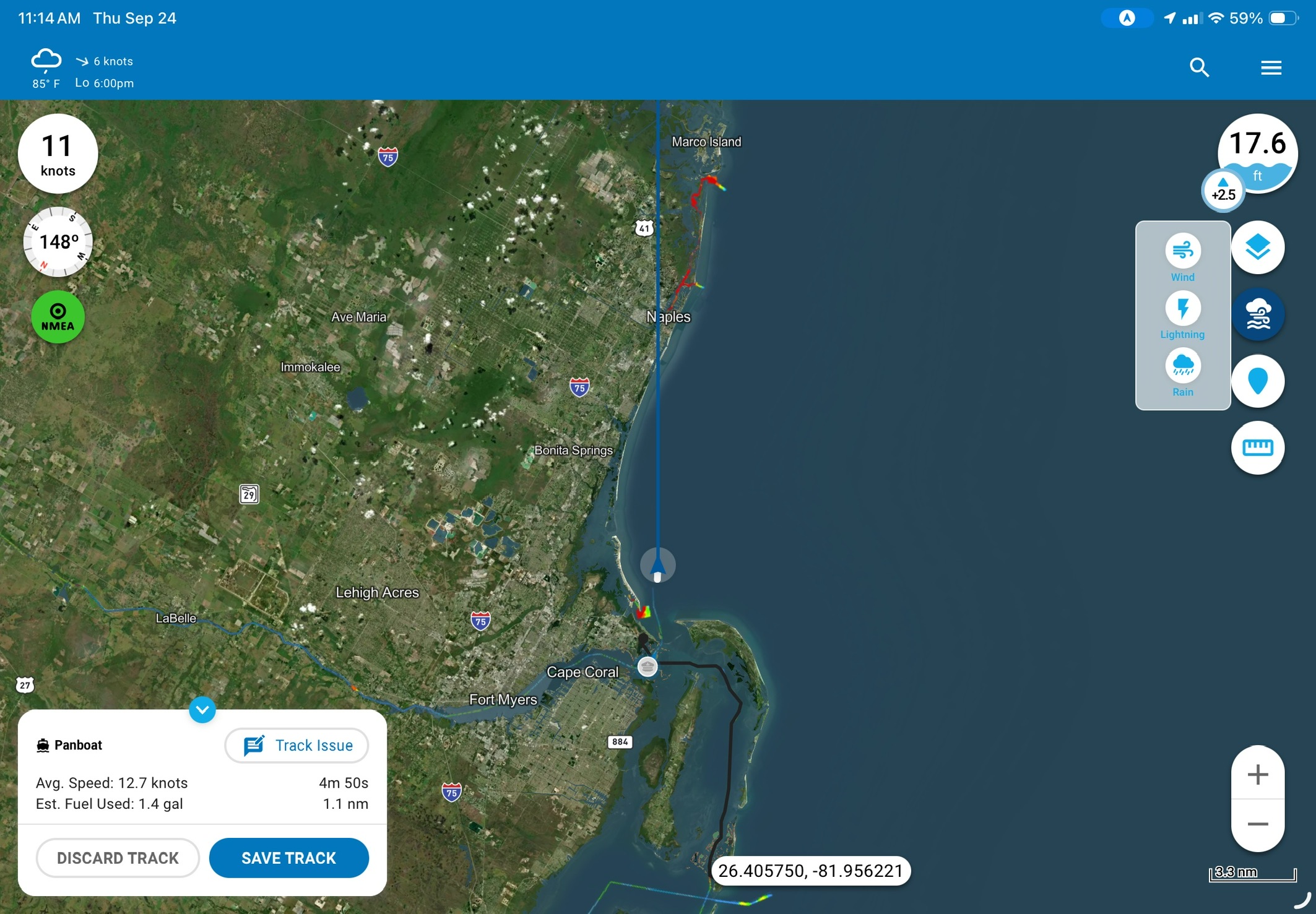
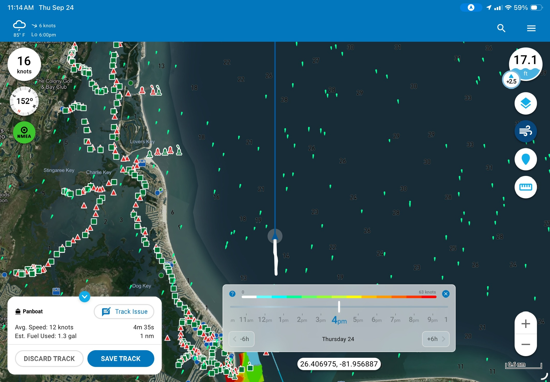
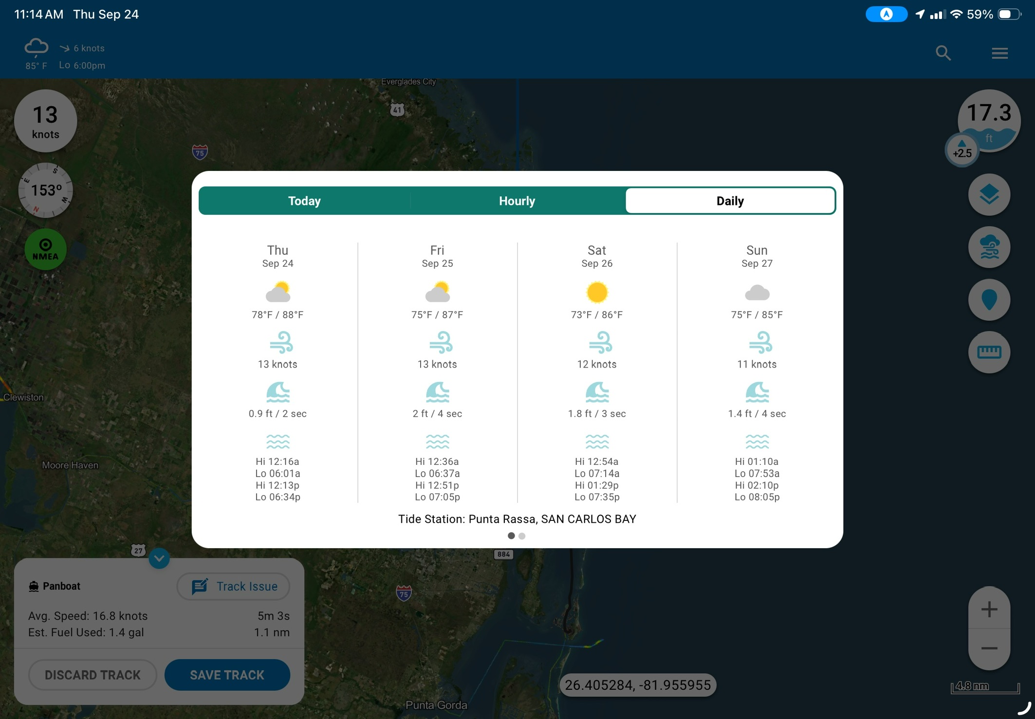
Argo’s weather displays are straightforward and easy to understand. However, I don’t think they will replace a dedicated weather app. The weather button on the right side of the display allows you to overlay wind, lightning strikes, and rain data on the displayed chart. Additionally, pressing the weather conditions in the top right of the display brings up a forecast dialog broken down by today, hourly, or daily. Hourly goes out 12 hours and daily goes out 7 days. As you scroll around the chart, the forecast is updated for the chart’s current location.
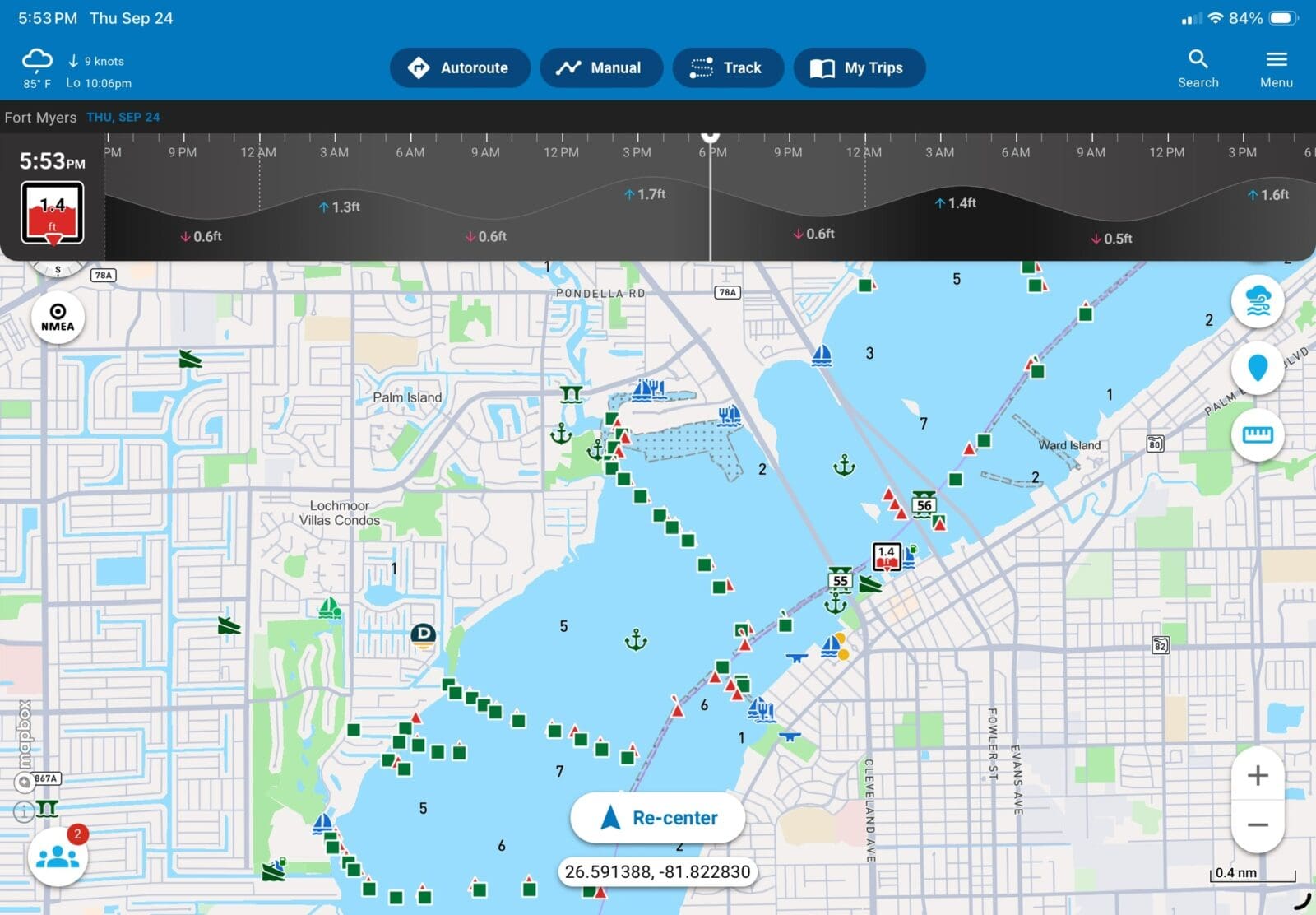
Current tide information is shown next to the depth information on the top right of the display. Additionally, the weather information on the top right shows the time and type of the next tide stage. However, I wasn’t able to find a way to display a graphic tide plot. Clicking a tide or current station on the chart brings up a graphical view of the station.
Pins / Social
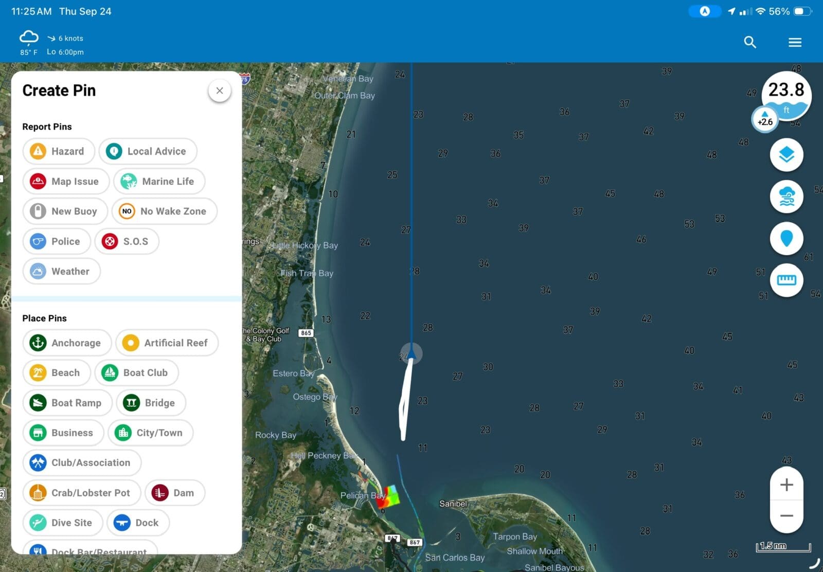
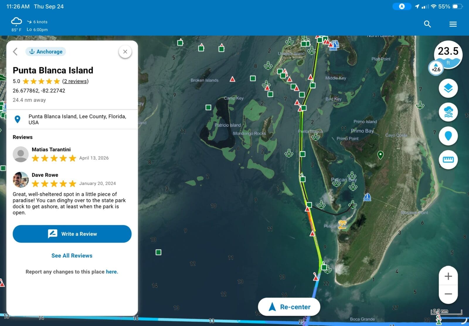
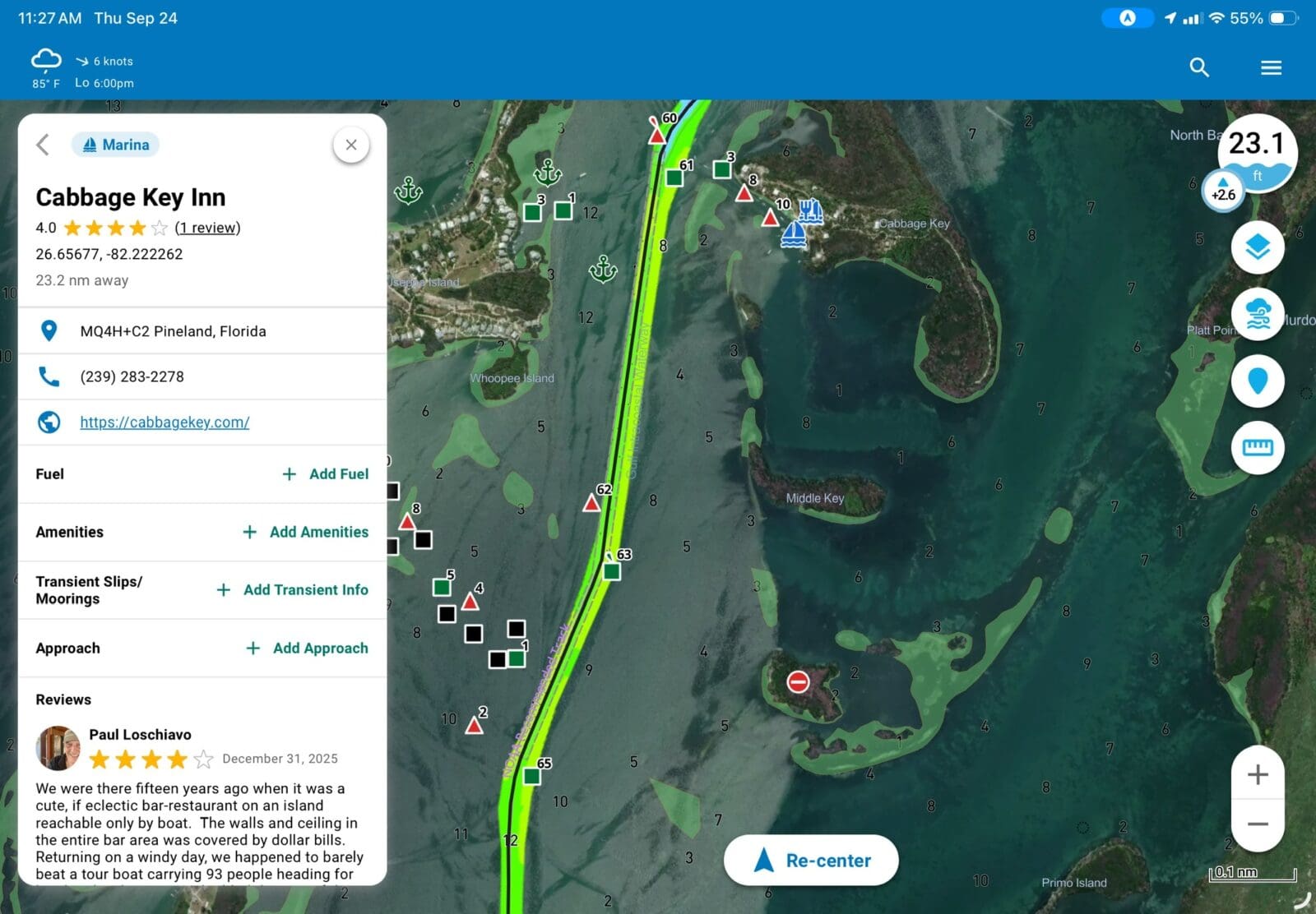
Argo’s crowdsourced data comes from pins. It appears many marinas, restaurants, anchorages, bridges, and service providers have been pre-populated. The implementation is clean and easy to use. Like so many crowdsourced databases, the function lives and dies by the size of the crowd and frequency of contributions. Currently, participation appears modest so there are typically none, one, or two reviews. Additionally, while restaurants and marinas have nice structured data showing the types of things you would need to know, anchorages don’t have that data. I’d love to see specific information for things like bottom type, depth, wind protection, and the rest of the data relevant to each pin type.
Argo, like every other boating app, has a social feature with friends, the ability to message, and post to a public feed. I suspect it’s a near requirement but — and this is in no way just the case for Argo — I can’t bring myself to get too excited about it. Every app has a social feed and honestly, if I want to message friends, it just doesn’t occur to me to go into a navigation app to do it. If I need mindless scrolling, I hit a broad market social network.
Instrumentation via WiFi
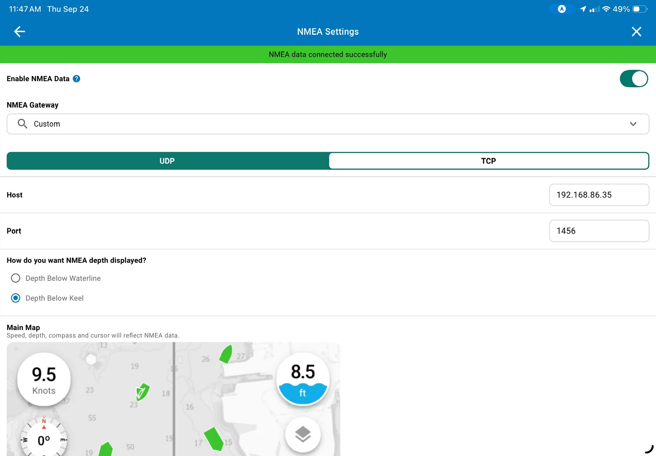
Argo’s instrumentation via WiFi relies on a device on your boat’s NMEA 2000 network making that data available via IP. Many recent AIS transceivers do this as do a number of NMEA 2000 to WiFi gateways like those from Actisense, Digital Yacht, Yacht Devices, and others. Once the data is available, Argo consumes position, heading, depth, and AIS data via the feed.
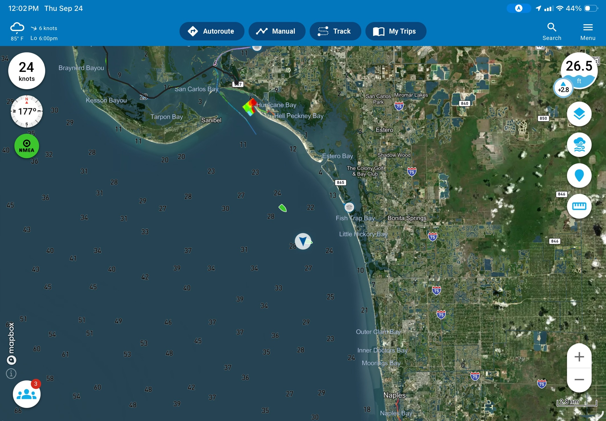
When data flows via WiFi, the NMEA circle in the upper left turns green, heading data (displayed directly above the NMEA circle) populates, and depth displays from the data stream. Additionally, AIS targets display on the chart and can be clicked for further details. Although the depth works well when NMEA data is available, I’m not a fan of how Argo handles depth without a NMEA data feed. Without the data feed, that same depth bubble appears in the upper right, but it uses the charted sounding at your current position rather than a measured depth. I fear that provides a false sense that the depth number is somehow measured and may get people in trouble.
Final thoughts
Argo is a relative newcomer to the world of mobile navigation apps. Judged on a curve due to its age, it stacks up exceptionally well. But, even without that curve, Argo remains extremely competitive. It still doesn’t have some of the advanced ICW cruising features Aqua Map brings. Nonetheless, it delivers strongly on the ease-of-use ambitions Jeff Foulk set out to achieve. In my mind, I have generally placed Navionics as the easiest navigation app to use and Aqua Map as the most feature rich. I think Argo still has some opportunities to add features before it catches Aqua Map. But, when it comes to ease of use, I think Argo is equal to or better than Navionics and with USACE surveys on the chart, it now has a feature Navionics doesn’t, and it’s the one I care about most.



Ben,
Thank you for posting this review of the Argo app. Your review has convinced me to give it a try for this fall’s delivery season. Hope to see you and the family on the water some day soon!
A very well presented review, as we have come to expect. As a total side issue, I find it interesting that it’s the US ARMY Corps of Engineers who conduct these surveys and not the Navy or Coastguard. An odd demarcation.
I bought the lifetime premium subscription when it was offered a few years ago. I’m also one of the top review posters (there’s no list, but it’s based on the number of times I see an anchor pin with no review but mine). It’s a great program, and advancing daily. But, the most important part — the free version is pretty awesome. Sure, there are features with premium, but you can do a lot with the free. It’s the one I recommend to anyone who asks “what app should I use.” At free, you can do LOTS of armchair nav — great for crew, or someone just wondering, or someone who only boats a few times a year.
Wow what an amazing app i had no idea existed. I just installed it and instantly hooked on using it. It’s the end of the season in NJ but I absolutely going to subscribe!
Obviously the USACE overlay is US only … but what is the global coverage of the standard charts?