NOAA shoreline doubts, or how NE Pt became an island
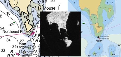
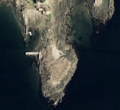
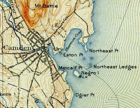
Yet another blizzard is descending on Panbo HQ, and that’s excuse enough to further indulge my obsession with local charting, specifically the issue mentioned on Monday about how Northeast Point became an island. It may be a trivial matter, but it does illustrate some technology NOAA is using these days, and perhaps why we should be skeptical about the results. The collage above shows how the Point’s shoreline has been depicted on the paper/raster version of chart 13307 for more than a century; the infrared aerial photograph, carefully taken near the time of mean high water, purportedly shows the actual shoreline; and the new vector version of 13307 shows how that recently acquired shoreline data was applied. The trouble is that some rocky reality seems to have been left out of the picture!…
At any rate, while NOAA did fix some of the dock mistakes I identified in the Inner Harbor, my photographs did not persuade them to veer from the infrared shoreline methodology. In fact, as noted on Monday, the new 1:40,000 scale raster chart 13305 has Northeast Pt. as a high tide island, and I imagine all NOAA’s chart will eventually, and possibly all the commercial charts (do they have a real choice?)…
I rechecked the tide level for the time our shoreline mapping photography was acquired. I used three slightly different methods, all of which we commonly use in this office for determining post-acquisition water levels for our mapping projects. The results I got varied between 10.65 feet and 10.82 feet above MLLW, based on applying offsets (both time and height) from the Bar Harbor reference station to the Rockland tidal sub-station. The known MHW level at Rockland is 10.17 feet. So at the time our photos were taken, the water level was about 0.48-0.65 ft. above MHW. The mean tide range at Rockland is 9.78 ft., and our standard tolerance for collecting tide-coordinated aerial imagery is ±10% of the tide range, or 0.98 ft. in this case. So, despite the fact that the water level was half-a-foot above MHW at the time our photos were taken, it was still well within our tolerance, and for mapping purposes the shoreline extracted from the imagery can be expected to represent the MHW line.
In other words, the NGS Remote Sensing Division followed our standard procedures for mapping the MHW line, and that line was properly applied to the ENC.
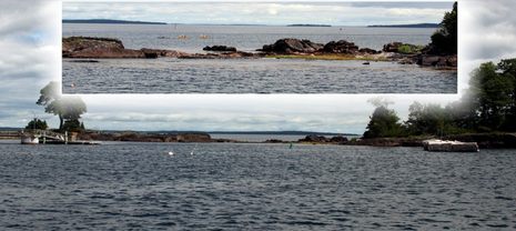
I also checked the preliminary tide level at Rockland (verified tides from CO-OPS are not yet available) for the date and time when Mr. Ellison’s ground level snapshots were taken, and I agree with his assessment that the tide was practically at the exact level of MHW (10.14-10.18 ft. above MLLW). It is hard to get a sense of scale in his snapshots, but in much of the neck area it appears that the rocky ledge projects significantly more than a foot above the water, in some spots possibly several feet.I cannot account as to why these rocks that appear to be completely bare in his photos taken at MHW, appear to be covered in our aerial photos taken at only a slightly higher tide level. Perhaps the uncertainties in determining the exact water levels are high in this area, possibly varying significantly with local weather conditions? In any case, the possible inaccuracies in the new shoreline do not appear to be very significant
for this location. As can be seen in Mr. Ellison’s snapshots, any bare ground connecting NE Point to the mainland is very low and narrow, and possibly broken (as he said) by gaps of water that you could step over. The original ENC shoreline was derived from the raster chart, in which the width of the bare neck was exaggerated for cartographic clarity. In addition, the entire neck area is surrounded by a Ledge – Covers/Uncovers line, which should indicate to any prudent mariner that it is not safe to navigate through this area.Therefore I don’t believe the problems with the new shoreline that Mr. Ellison reported rise to the level of “critical correction”. Perhaps the next time NOAA maps the shoreline in this area we will have better data and methods, which might allow us to chart the MHW line at Northeast Point such that it more closely “conforms to reality”, but for now I believe the ENC should be left as it is.
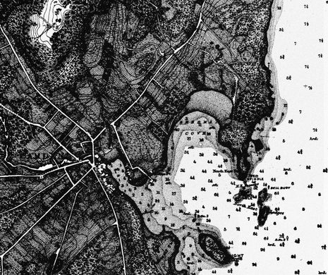


I wish I had a better scan of that last chart, created in 1864. It looks like the cartographers etched detailed buildings, woods, and fields over the topographic lines. It’s also interesting to see that they used feet to express the spot soundings less than 18′, the shaded areas, deeper water is in fathoms. It’s a bit confusing now, but does seem like a clever way to minimize the number of numbers on the chart.
Incidentally, I think I found that chart, along with many others, at the Library of Congress:
https://panbo.com/archives/2005/09/antique_maps_super_high_resolution_free.html
And the University of New Hampshire offers a terrific collection of high resolution antique New England topo maps:
http://docs.unh.edu/nhtopos/nhtopos.htm
You gotta move, Ben, your work in Camden is done, the charts are Good Enough For Gov’t Work (GEFGW) and Annapolis needs you. Just think of it, less snow, longer summers, and Federal offices within bowshot….
The Historic Topographic Map collection referenced has been expanded beyond New England to include most of the Northeast United States. Lots of great information for Cartographic Research, all found at:
http://historical.mytopo.com/index.cfm
Comparing satellite imagery and real geography to chart data could be lots of fun.
There are smaller things, like the old dredged area in the Big Pine Key that NOAA insists on showing as a “phantom” pier extending 100s of yards into the bay.
There are bigger things like this one:
http://polarnavy.wordpress.com/2010/08/29/fun-with-enc-charts/ . This issue has been fixed since – there are now new cells covering this area and bridge now lines up with the real bridge perfectly (though for some reason it lost its pylons)
I think this issue is partially a result of relying on automatic conversion where human cartographer may have been helpful.
Actually, as a reply to self, no – the issue has not been fixed.
I looked at the wrong bridge earlier today. Those missing pylons should have been a good clue but my brain was half-asleep, sorry ’bout that 🙂
So, after a number people contacted NOAA and got replies to the effect that this will be looked into, and after more than 6 months passed – no change. That’s unfortunate.
Greetings, I “discovered” a 7.5′ ledge in the middle of White Head Passage in Portland Harbor. I knew wher eI was at the time and was agrivated enough to send a diver back to see what it was that shaved off 12 pounds of lead in and area 29 feet charted. The diver reported that the knife point was covered in various colors of bottom paint indicating that there were recent similar discoveries.
I recollect that a fishing boat sank several years ago and the Captain was accused of being “off the channel”. The brand new Portland Fire Boat also came to grief there and the captain was “retired” amid cries of incompetence. If you talk to the local head boat captains the rock had been discovered numerous times but for understandable Coast Guard inquiry reasons they weren’t interested in “admitting” the discovery.
I also remember a large cruisliner that “discovered” a very large un charted glacial eratic near Marthas Vinyard.
The point is that charts are interpretations by cartographers using limited data. When the cartographer looks directly at objective information that indicates the methology of collecting information is suspect and sticks to the flawed process we know that there is a real problem brewing.
This is an endemic problem which relates to the recent inclination to use computers to create complex mathematical models and the disinclination to field check the models interepretations. Models can not help but contain the biases of the modeler. Biases are personal and sometimes it is more important to protect the bias than to field check the relationship of the model to reality.
Unfortunately most people when they “discover” a ledge immediately jump the the conclution that they were at fault (rather than the cartographer’s interpretation was incorect) and were off the channel. Add that uncertainty to the reluctance of the cartographers to conceede that their interpretation of the data was flawed and there is the situation where there are now false facts. Darwin said that false facts were the most dangerous to science because they linger where as false interpetations quickly vanish because every one takes delight in pointing out the error.
The reality is that the charts we use often show more detail than the data used to compile them justifies.
Thanks, Phin! It would be great if you could add your local ledge knowledge as a Hazard Marker in ActiveCaptain:
https://www.activecaptain.com/
If you have a Navionics Mobile app running on an iPhone or similar it could be added there too. The more, the merrier. Or send the lat/long of the ledge to me, ben.ellison at panbo.com and I’ll make the entry.
I also heard that NOAA is sending a survey vessel to Maine next summer, and I know they sometimes read this blog 😉