

Hint.fm Wind Map, genius!
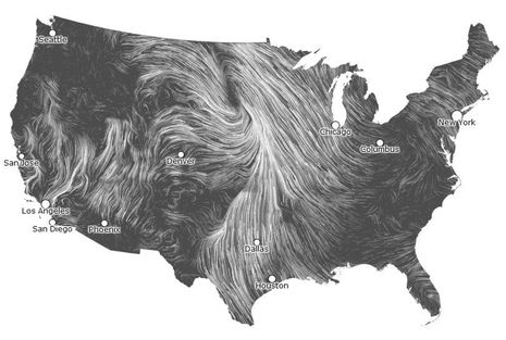
It’s a beautiful data graphic even as a static screenshot, but you must check out Hint.fm’s live Wind Map. Is it just me or is Wind Map the best presentation of macro wind direction and speed ever? It let me almost feel what that big low over the upper Midwest was doing yesterday, and if I was teaching weather I’ll bet this is a live graphic that would help students truly get it. And while the two talented guys behind Hint.fm may characterize Wind Map as “a personal art project” I can’t help but wonder how this presentation style and data source might benefit boaters…


Recent Panbo Comments